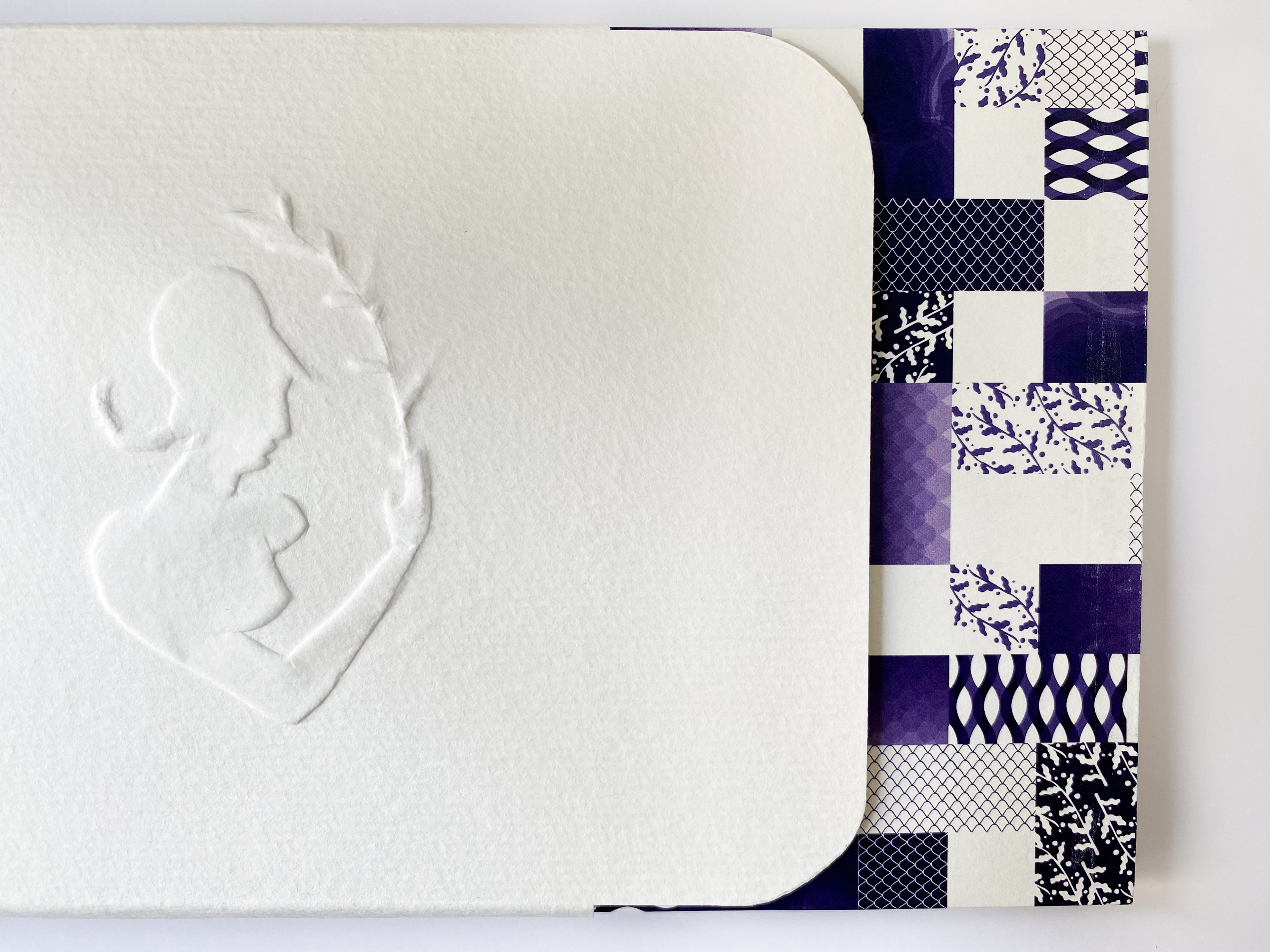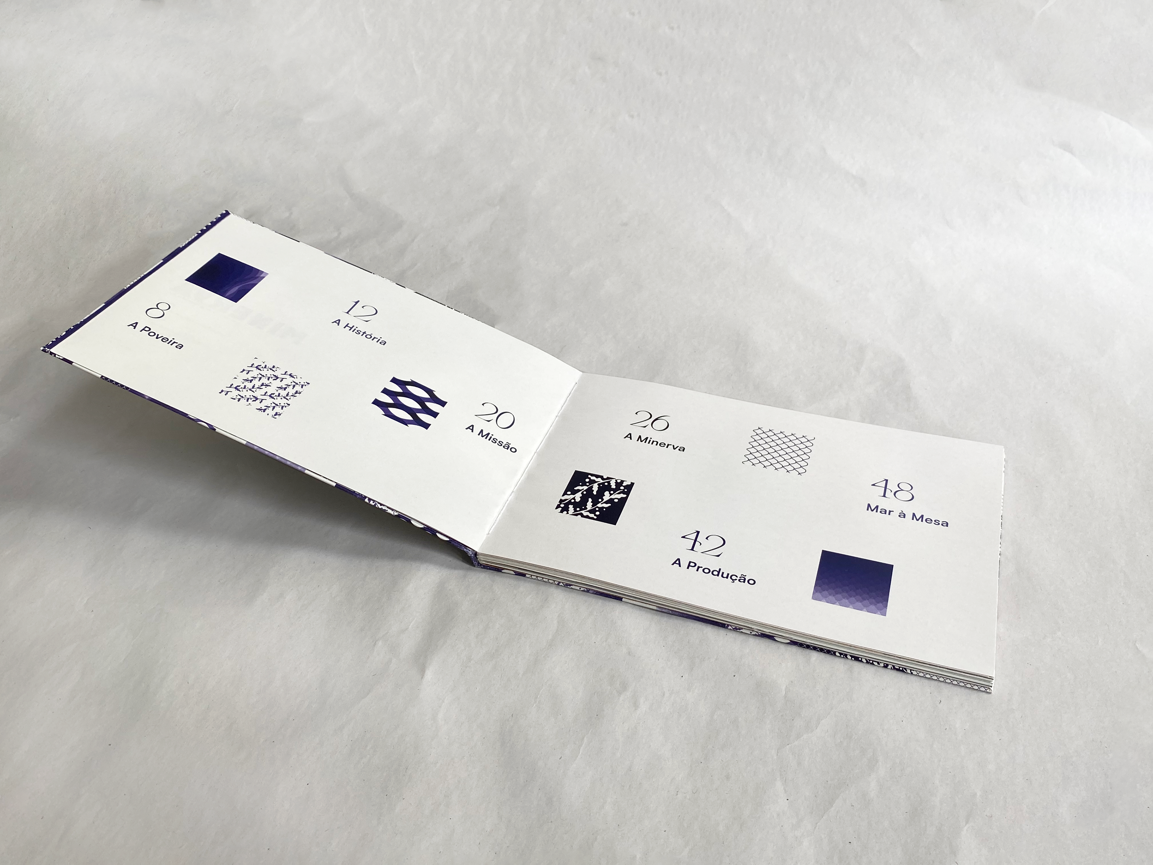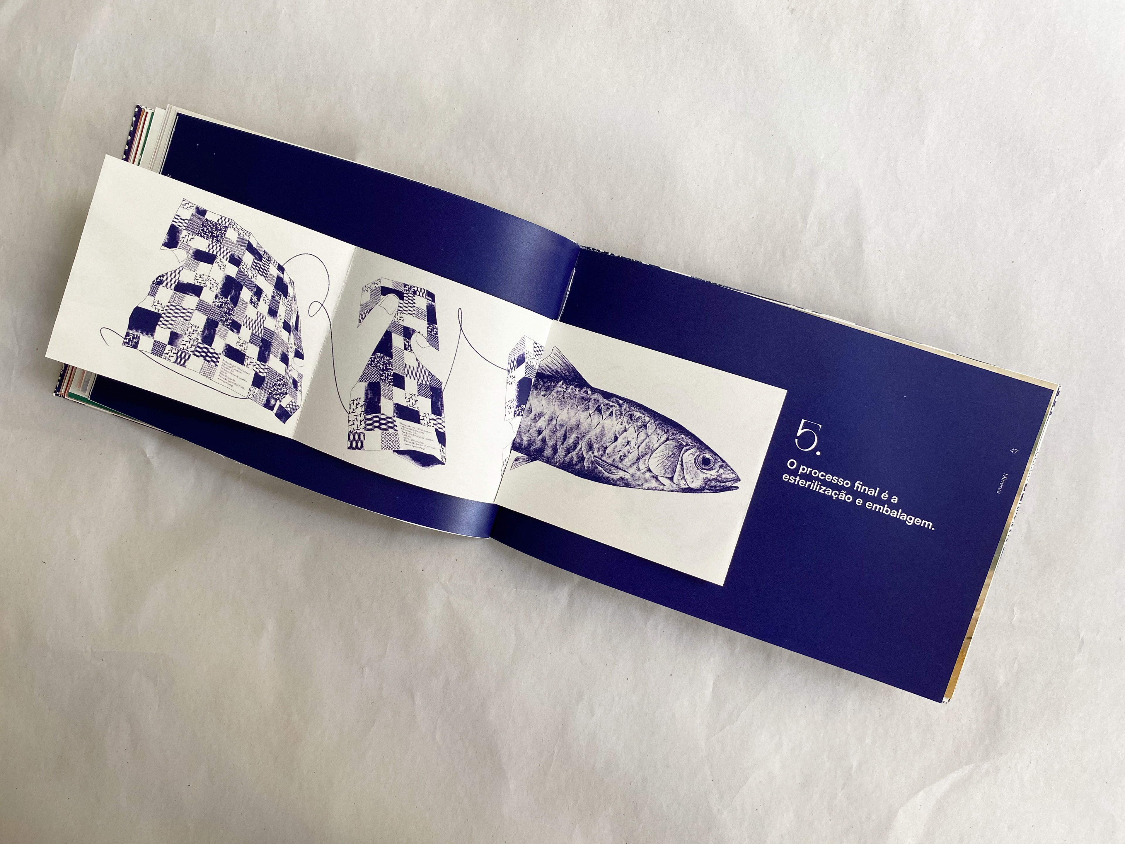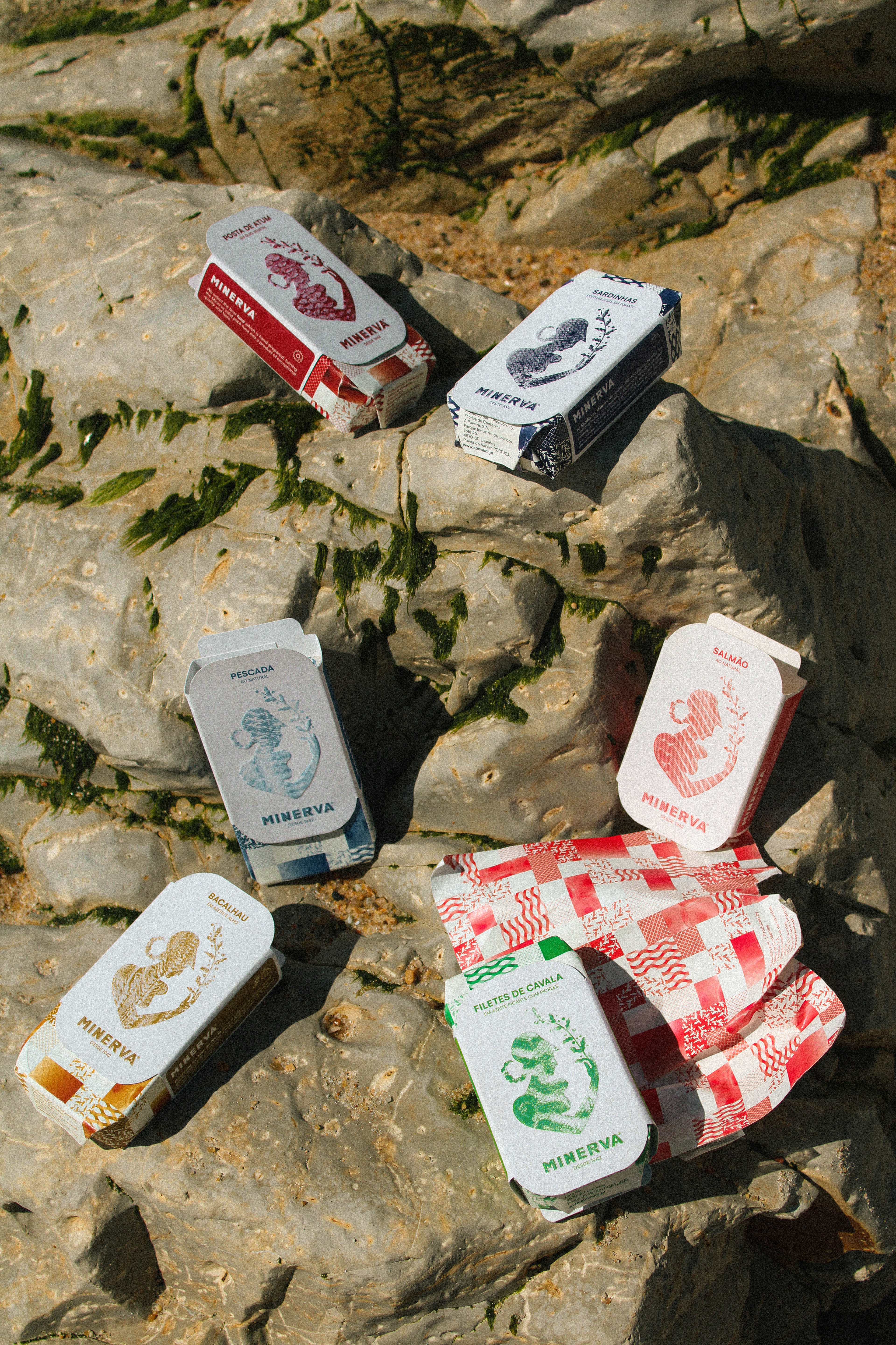
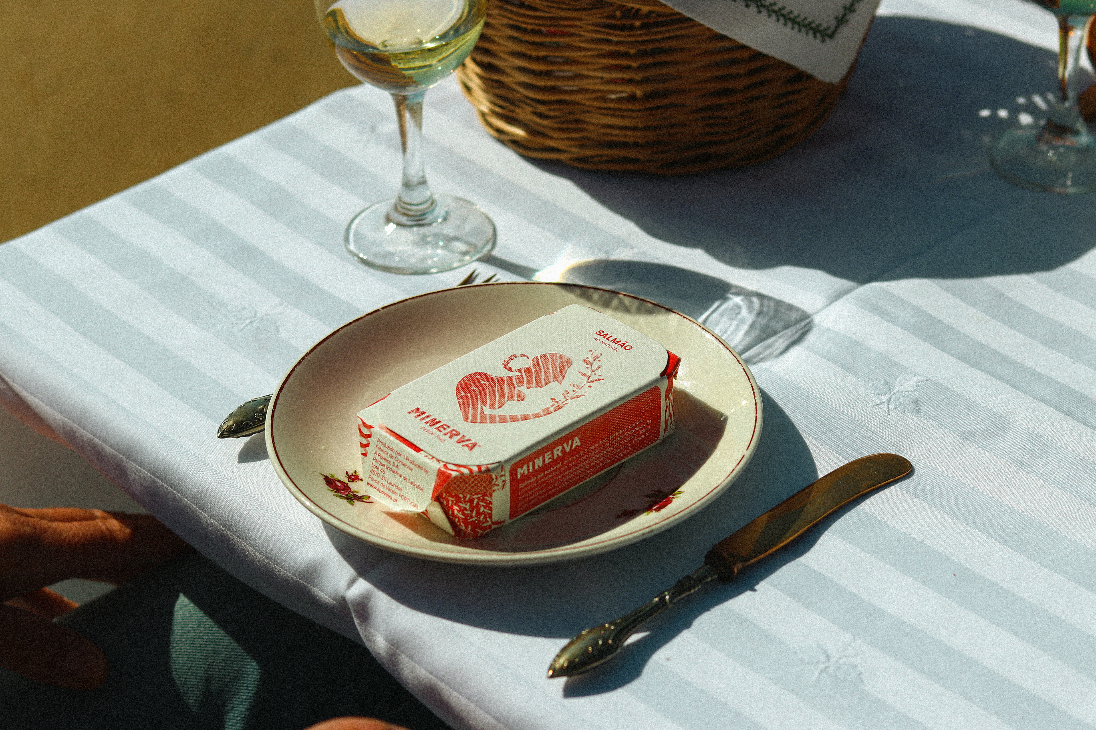
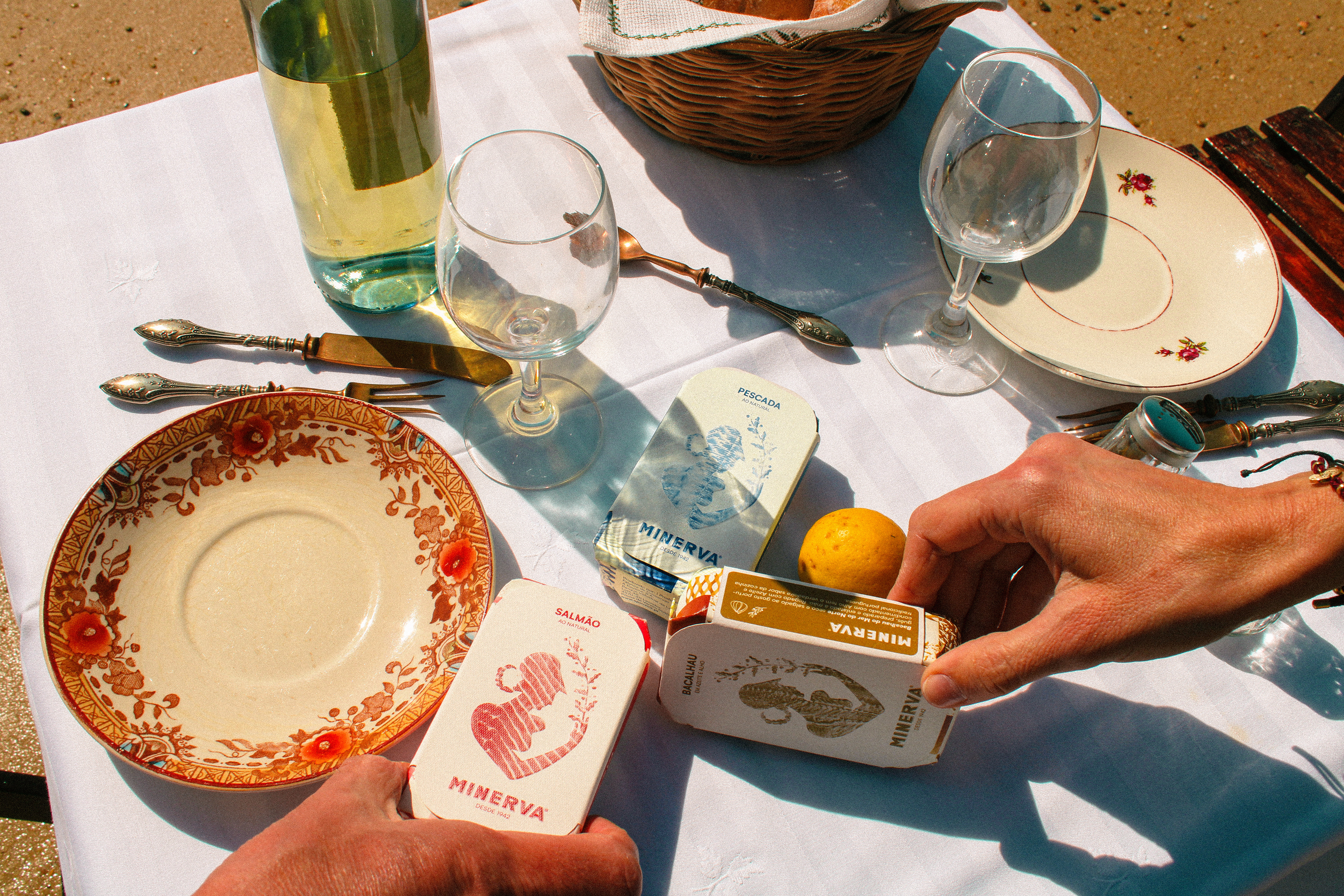
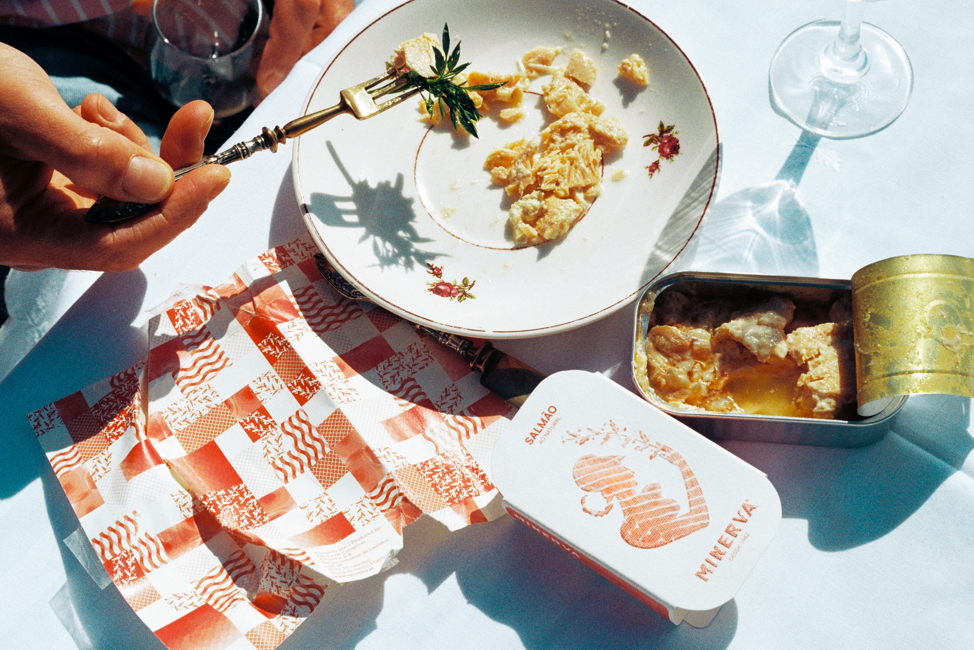
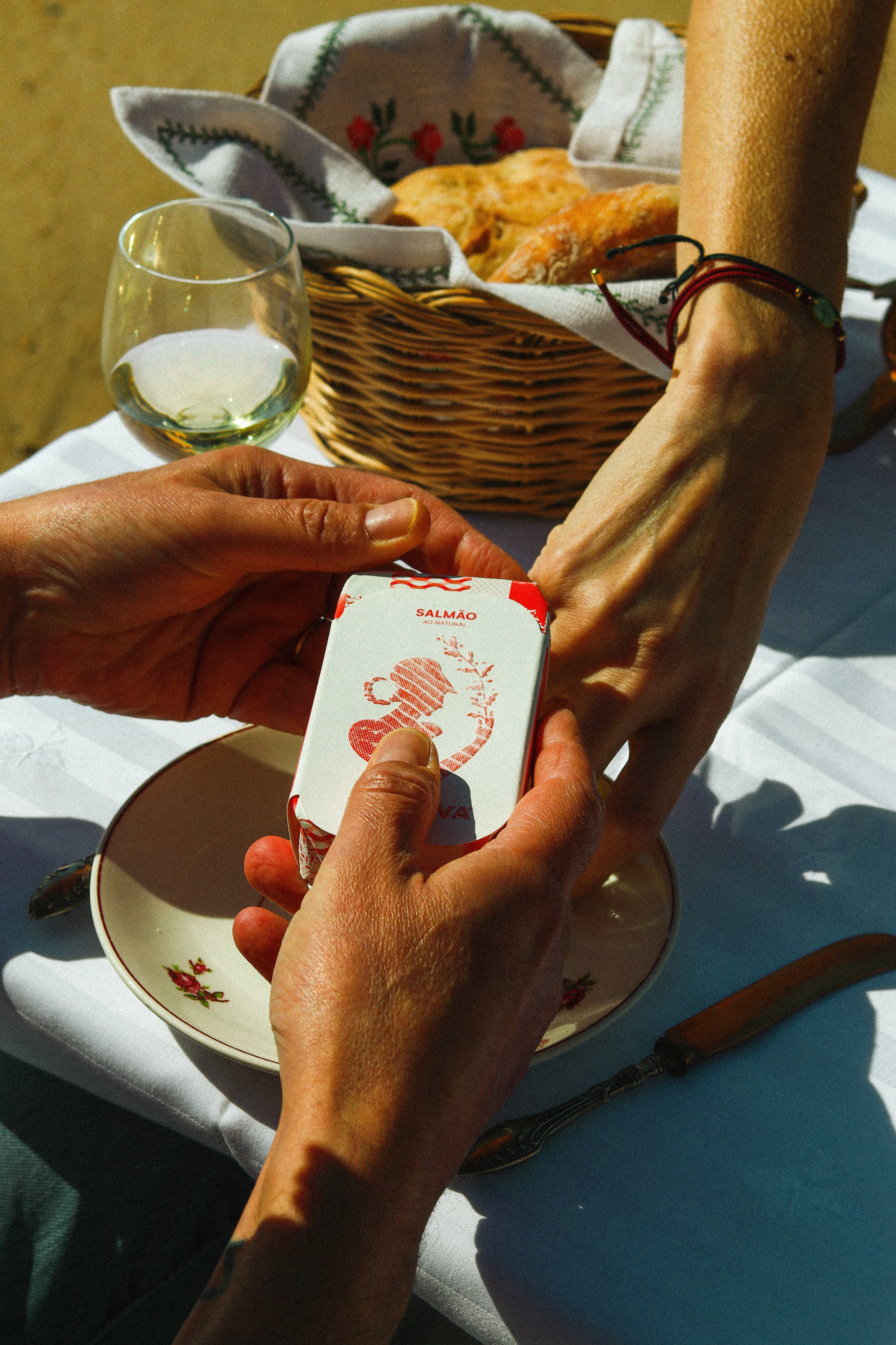
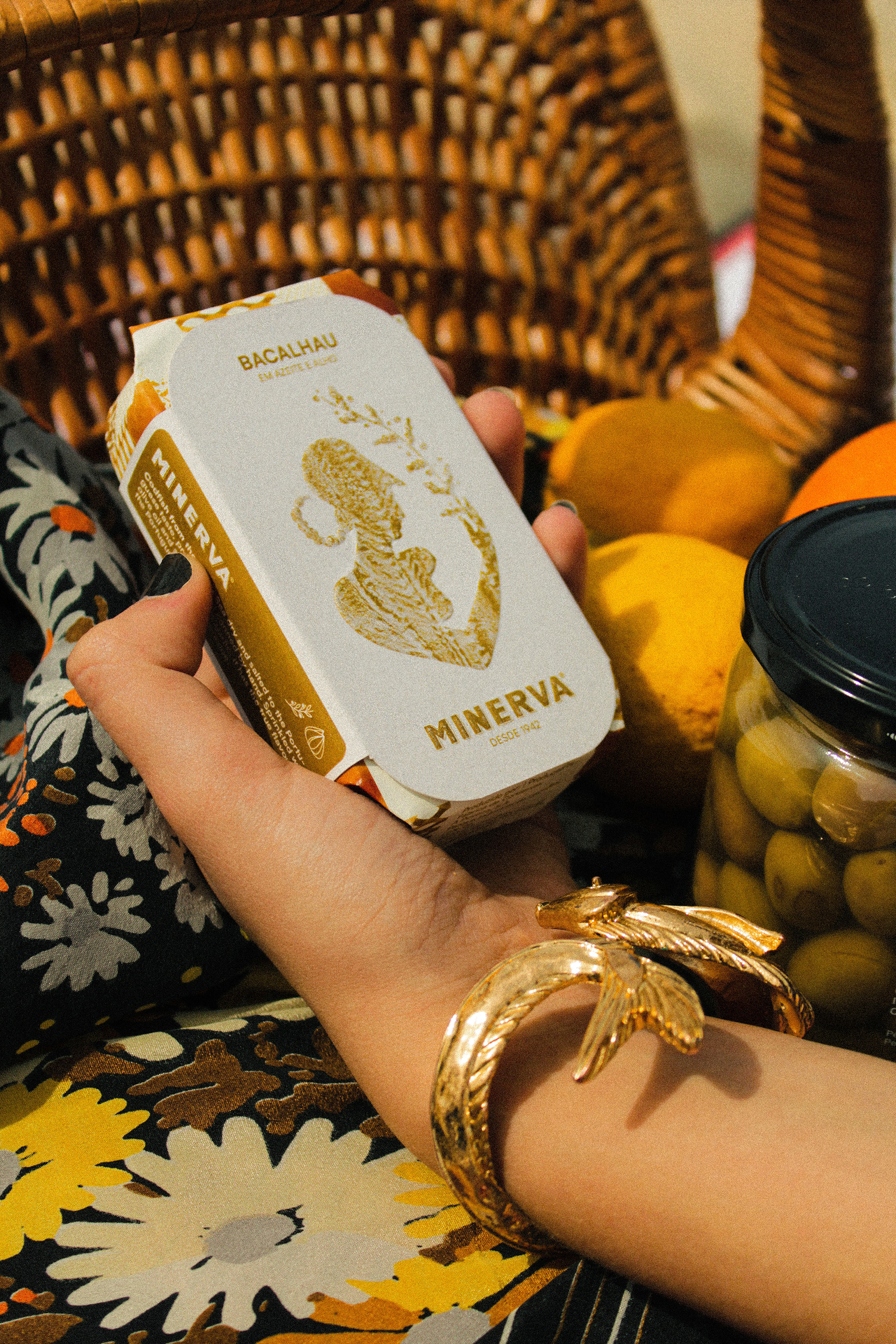
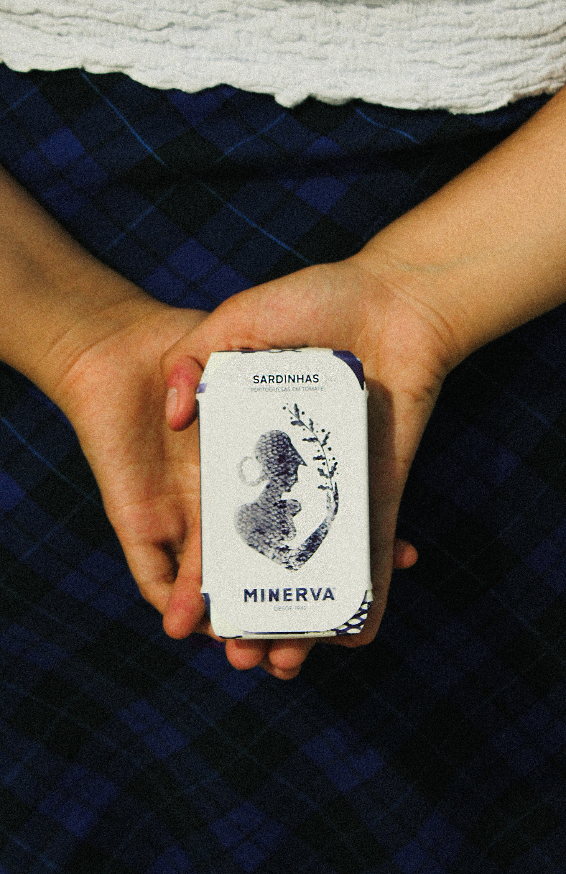
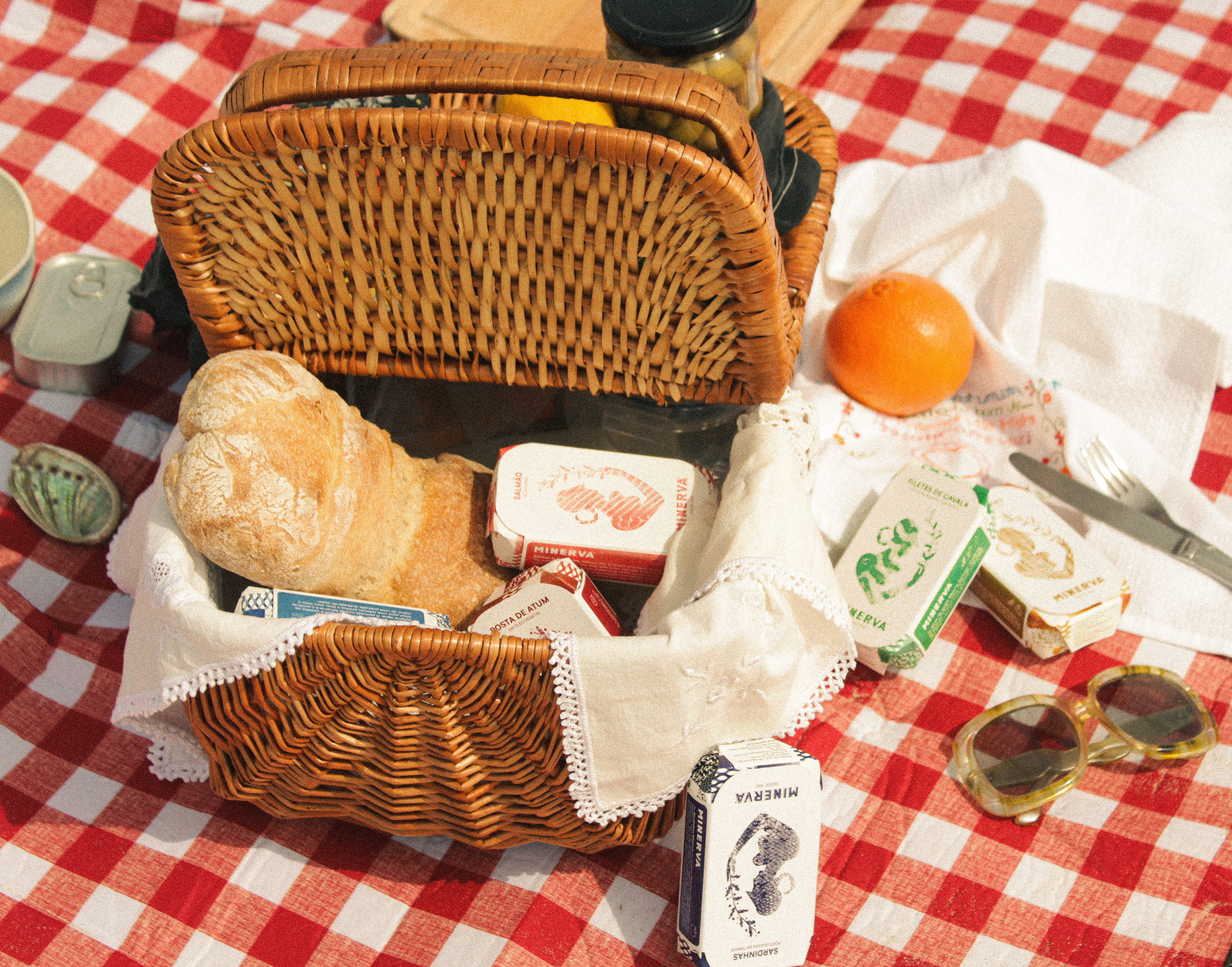
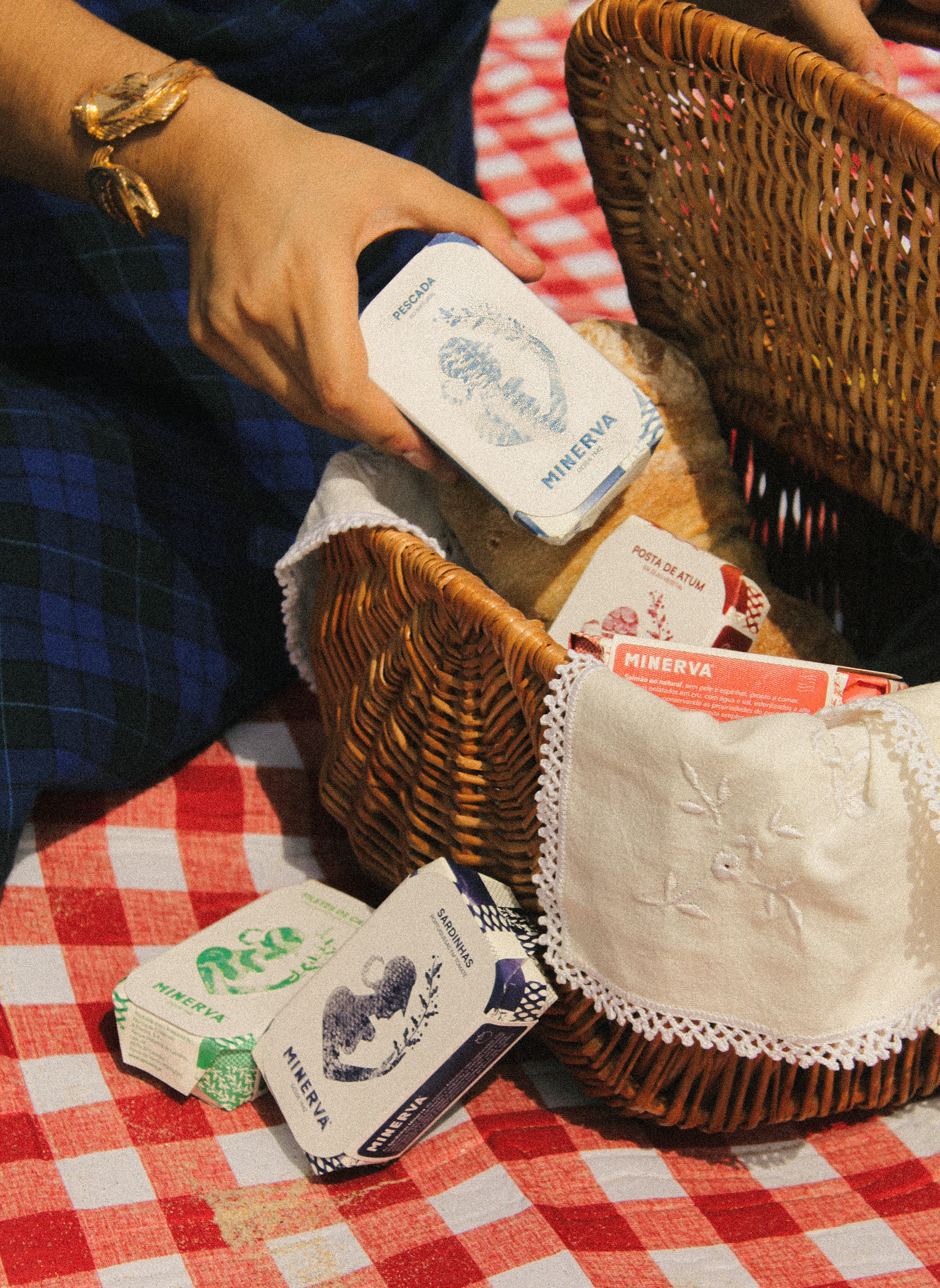
The previous illustration of the goddess Minerva was substituted for a minimalistic silhouette, that adquires a color and a different texture depending on the fish. For the wrap paper, a pattern was created that reminds the classic Portuguese tiles. The pattern has motifs of the sea, like waves, scales and fishnets. An iconography was also created to easily identify the type of preservation (oil, natural ou olive oil) and some additional ingredients it may have.

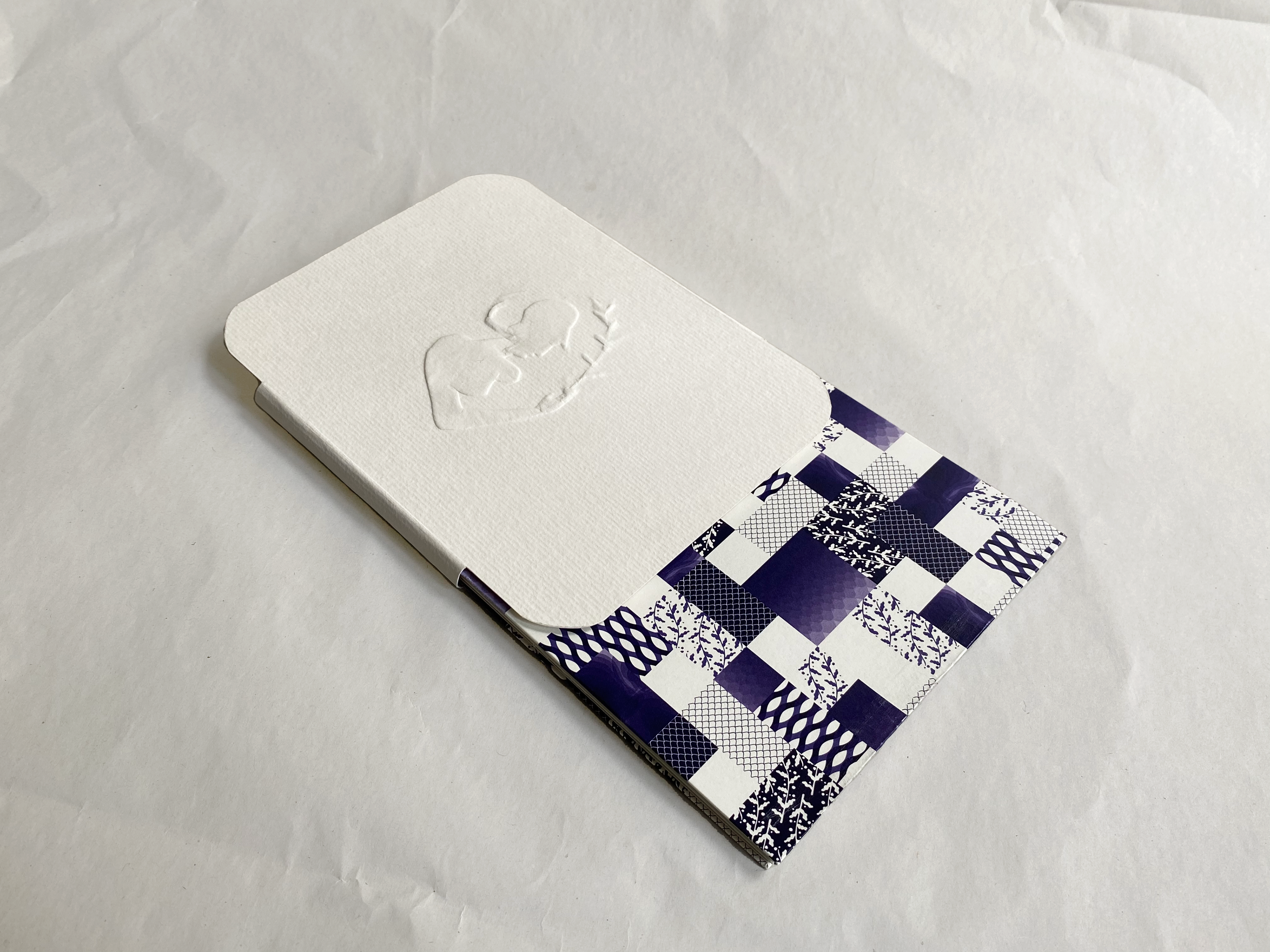
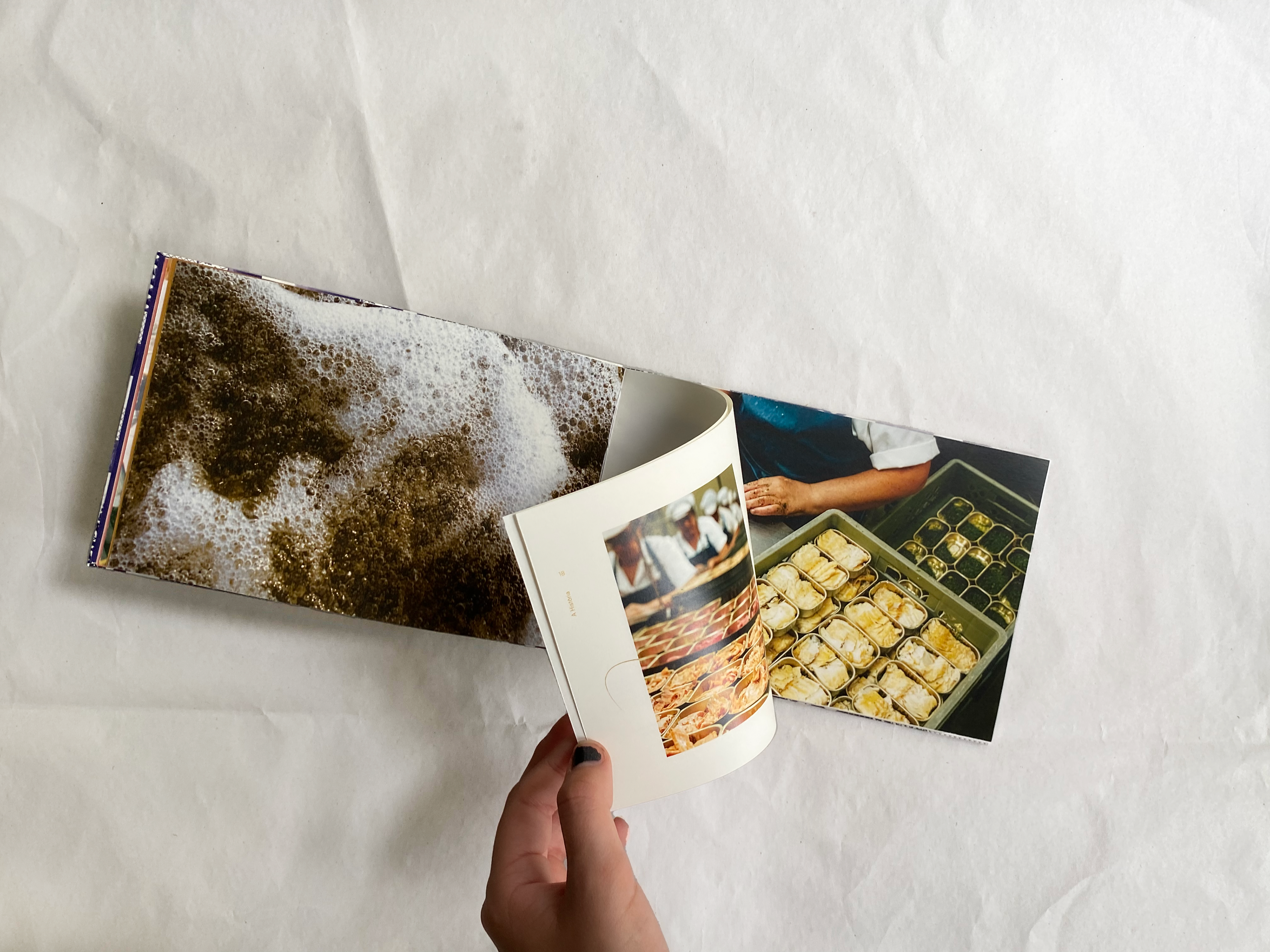
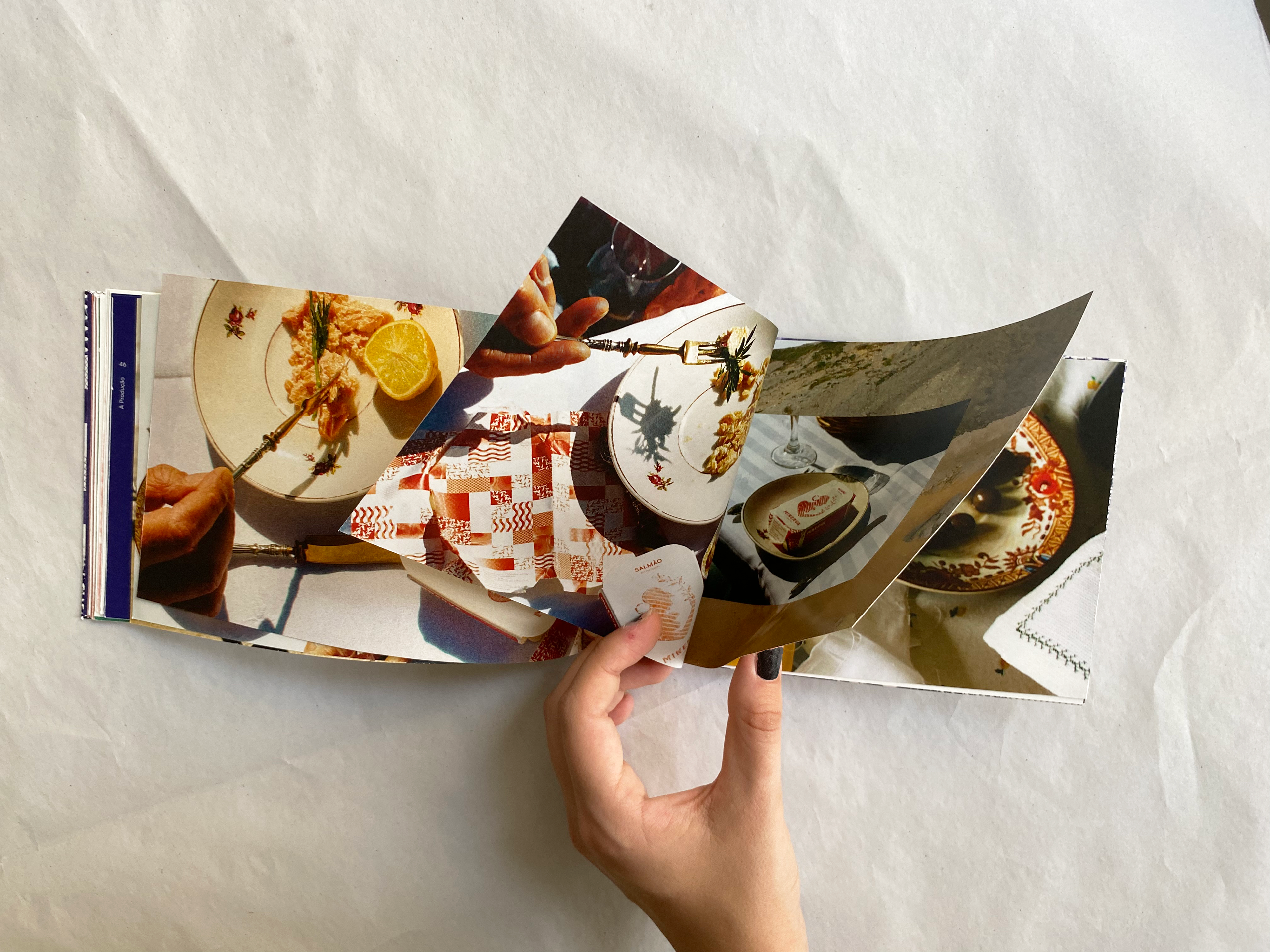
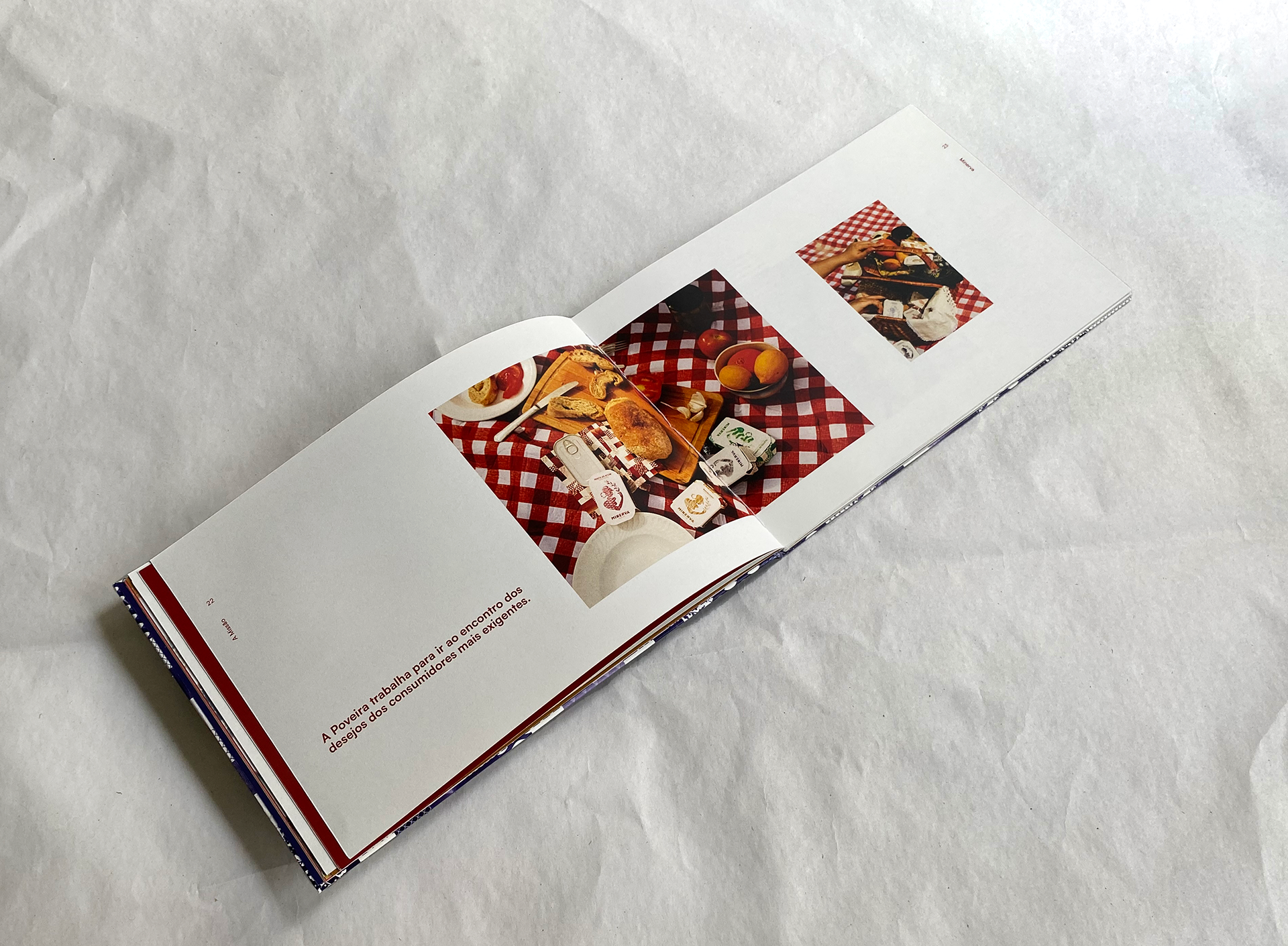
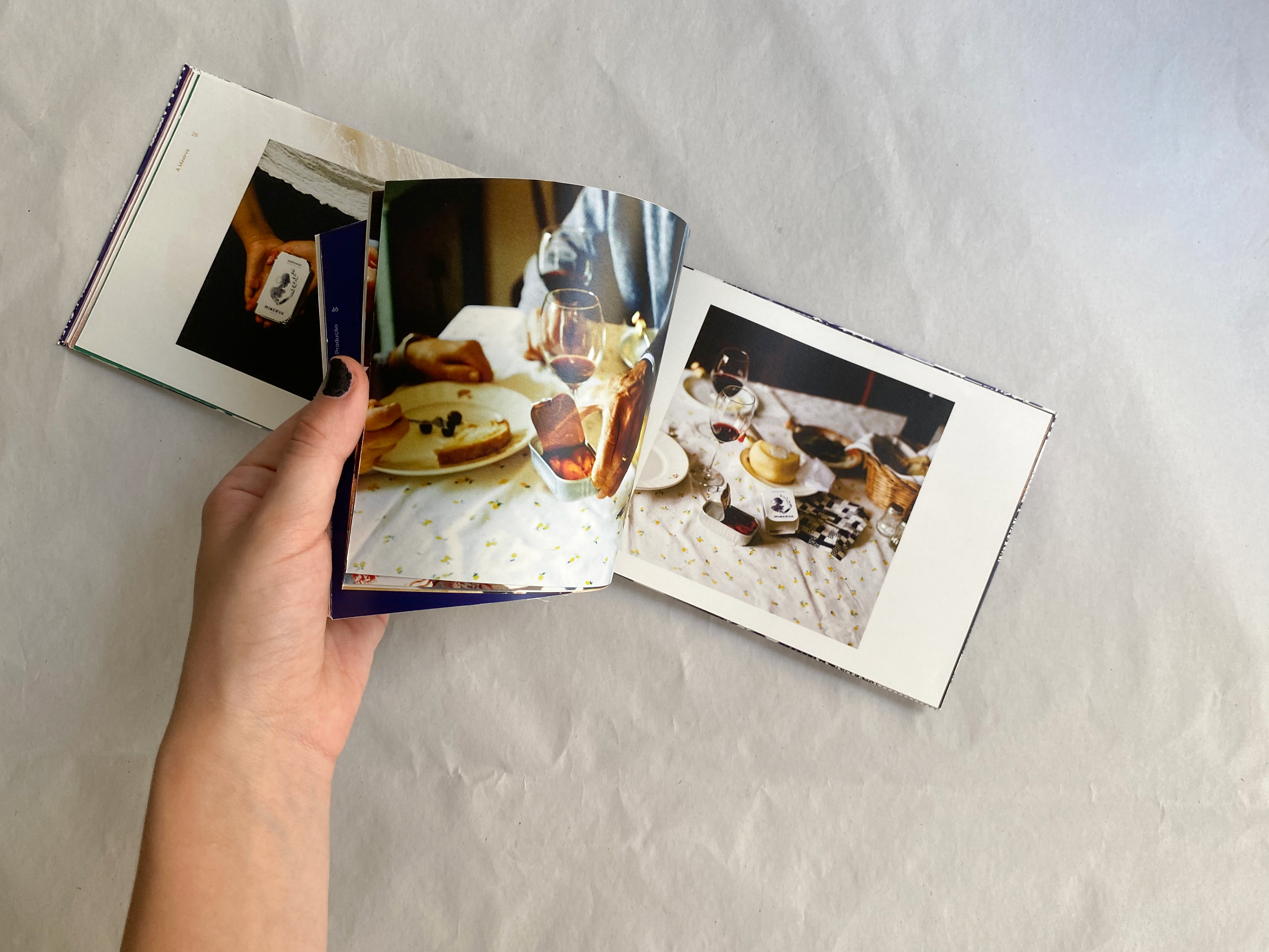
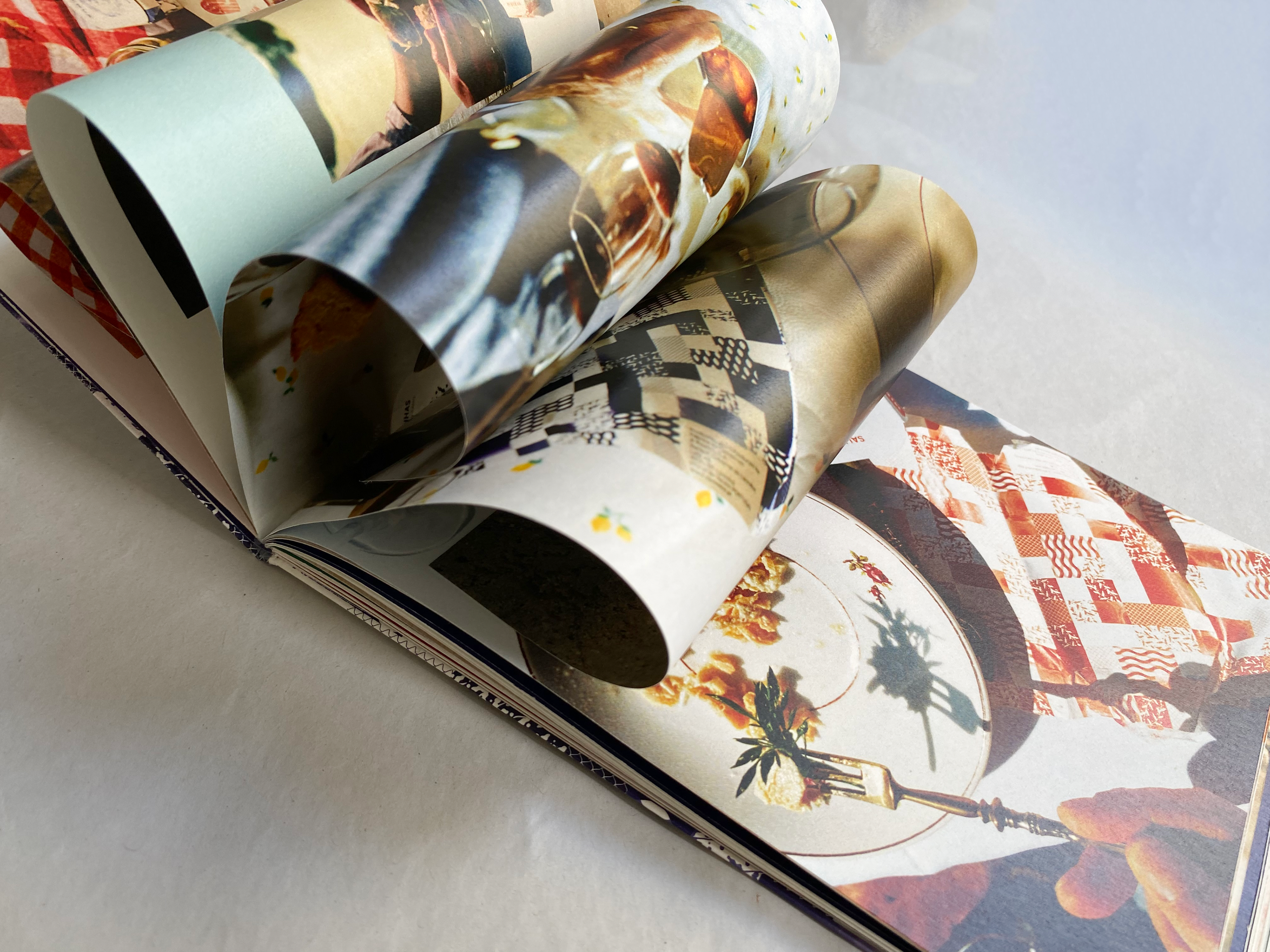
All the work of the new identity resulted in a catalog that presents the new aesthetic while telling the story of the brand . The format of the cover resembles a fish can, and it features photography and illustration that embraces the concept of nostalgia allied with modernity.