
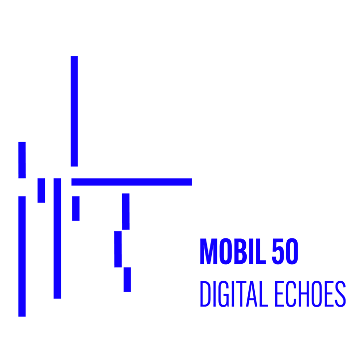
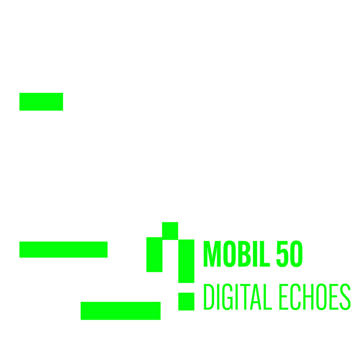
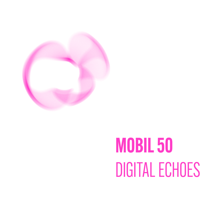
The blue thin rectangles refer to the “beep” sound commonly used on the ringtones across history. This “beep” sound is usually sharp and strident, so the rectangles are thin and elongated to represent this. The vibrant green squares represent the impact and boldness of the ringtones. They also make reference to the visual era of the pixelated visuals, predominantly the 80s and the 90s. The aura like magenta shapes are a visual depiction of the celestial and flowy sounds the newer forms of ringtones tend to incorporate. They are also a representation of the vibration and sound propagation, therefore the change in opacity refers to the sound fading away.
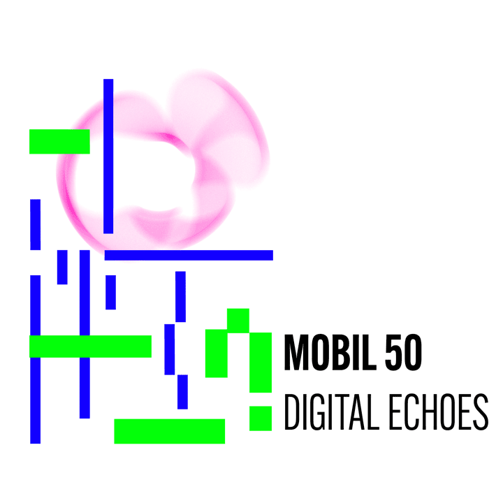
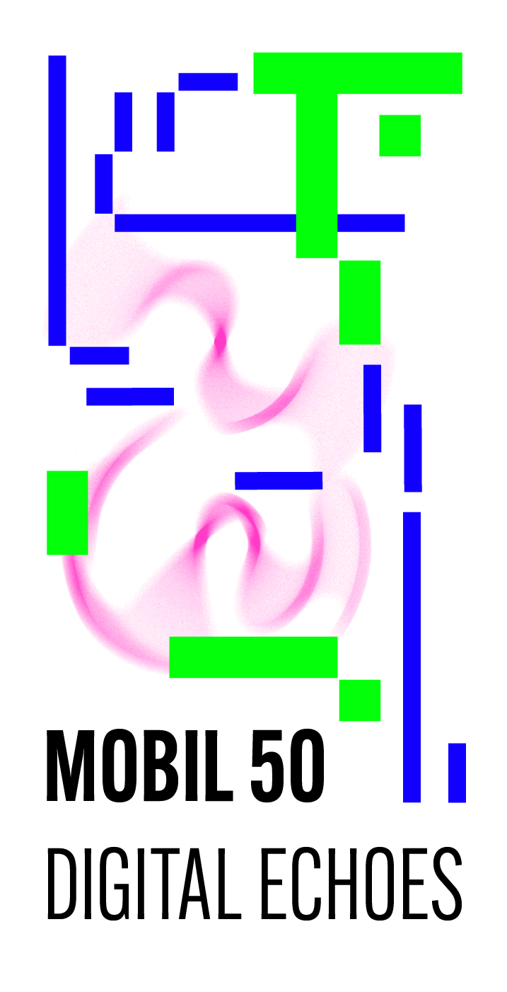
horizontal and vertical main version of the logo
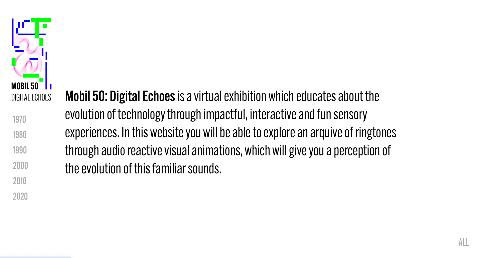
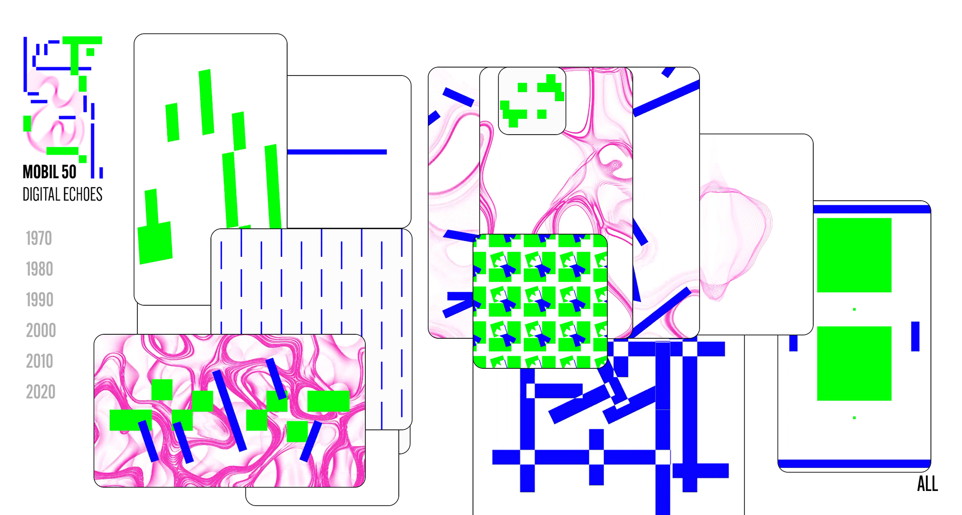
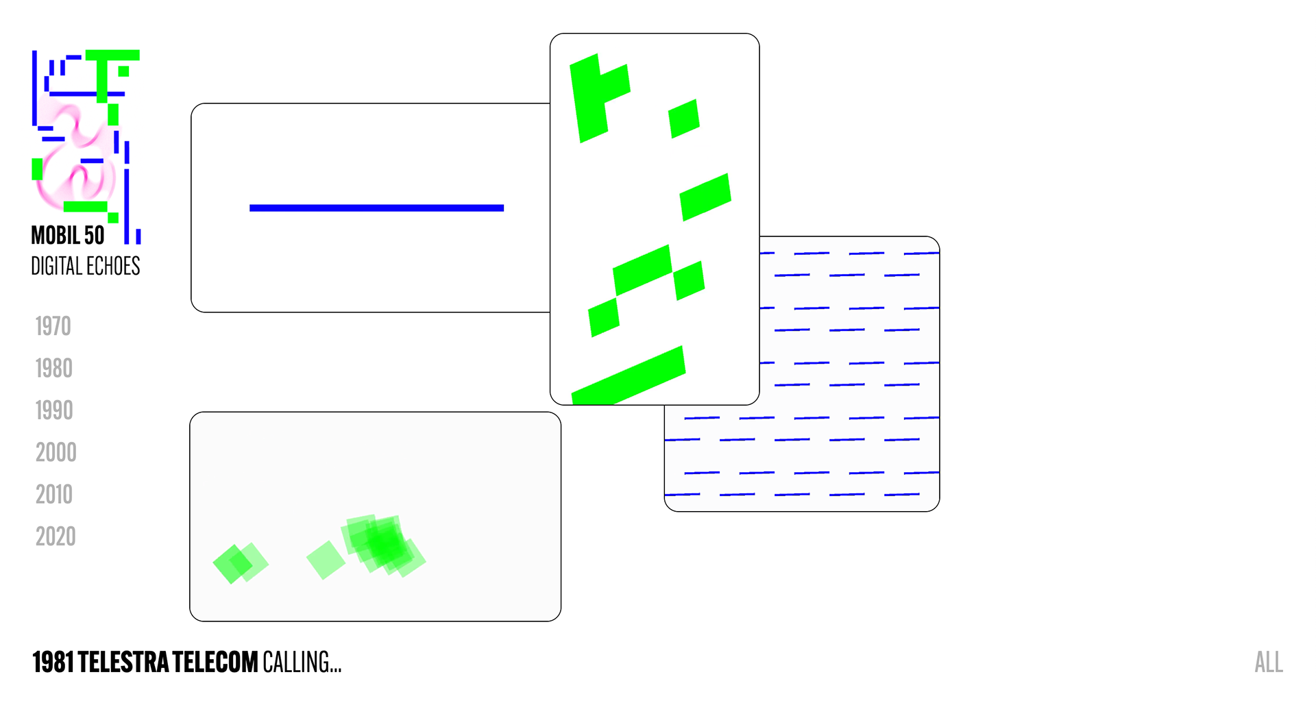
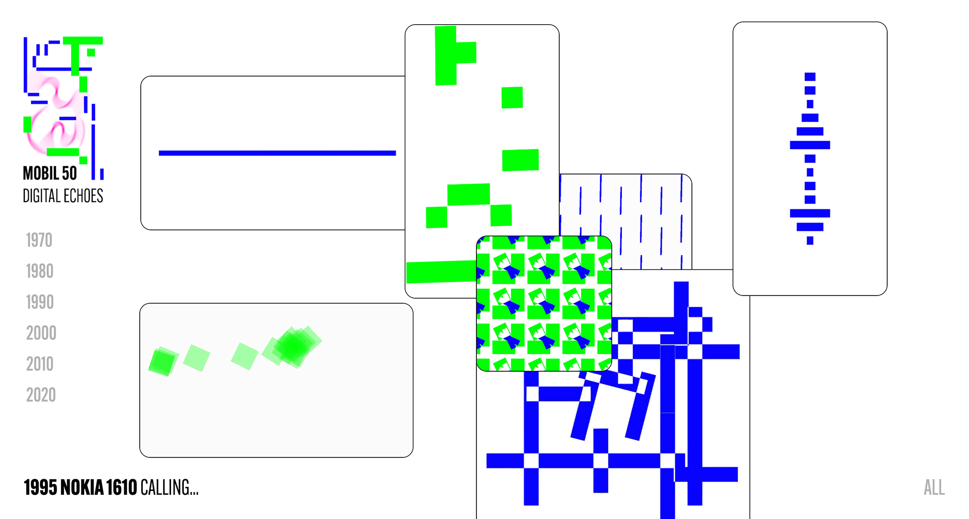
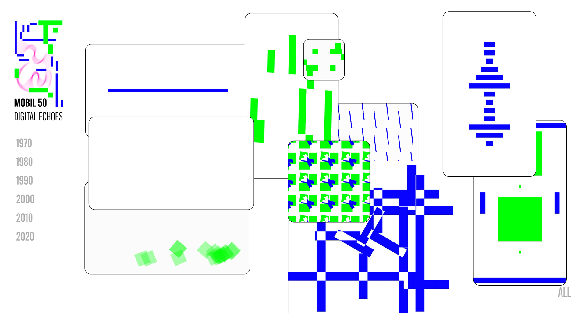
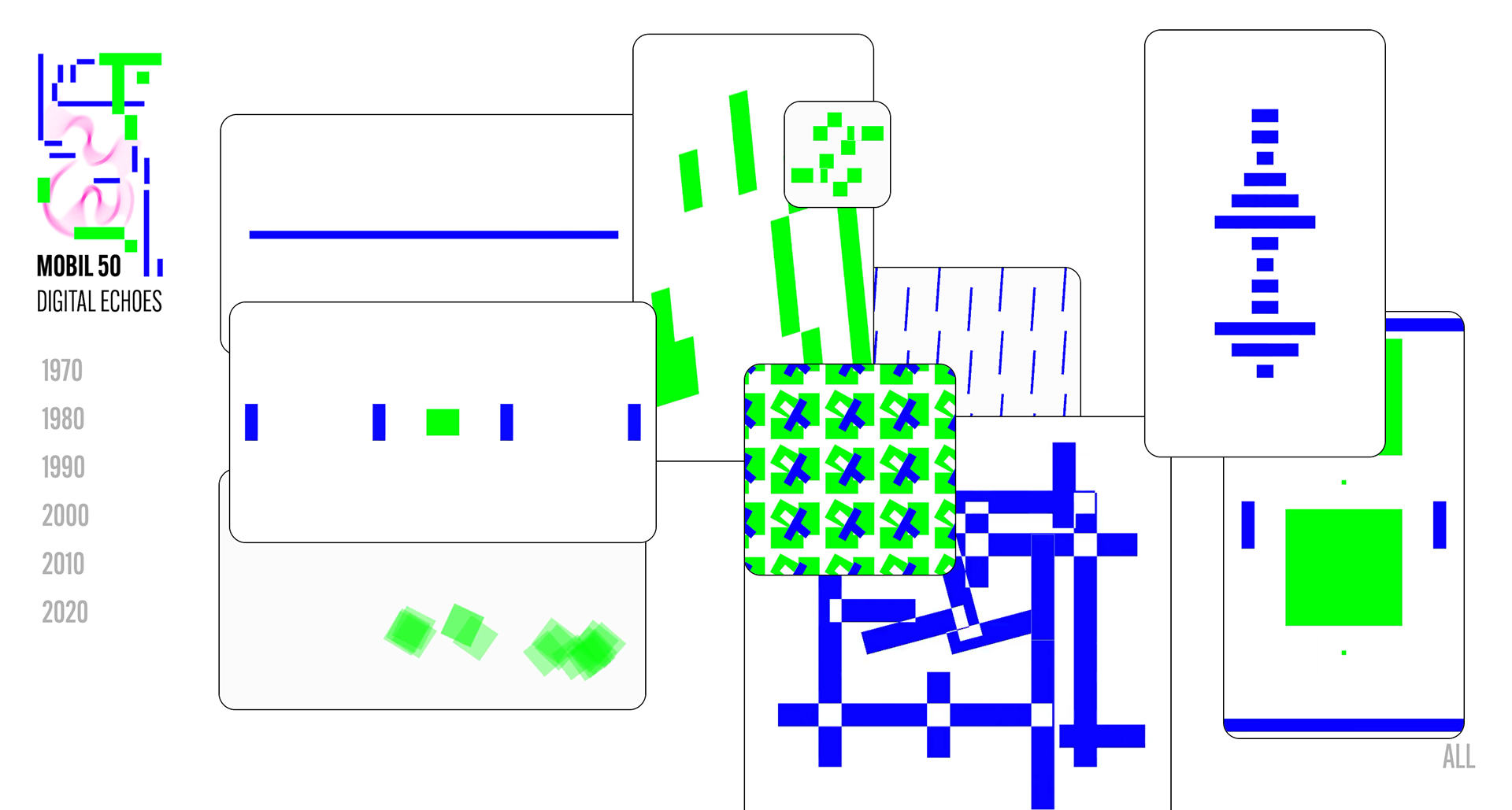
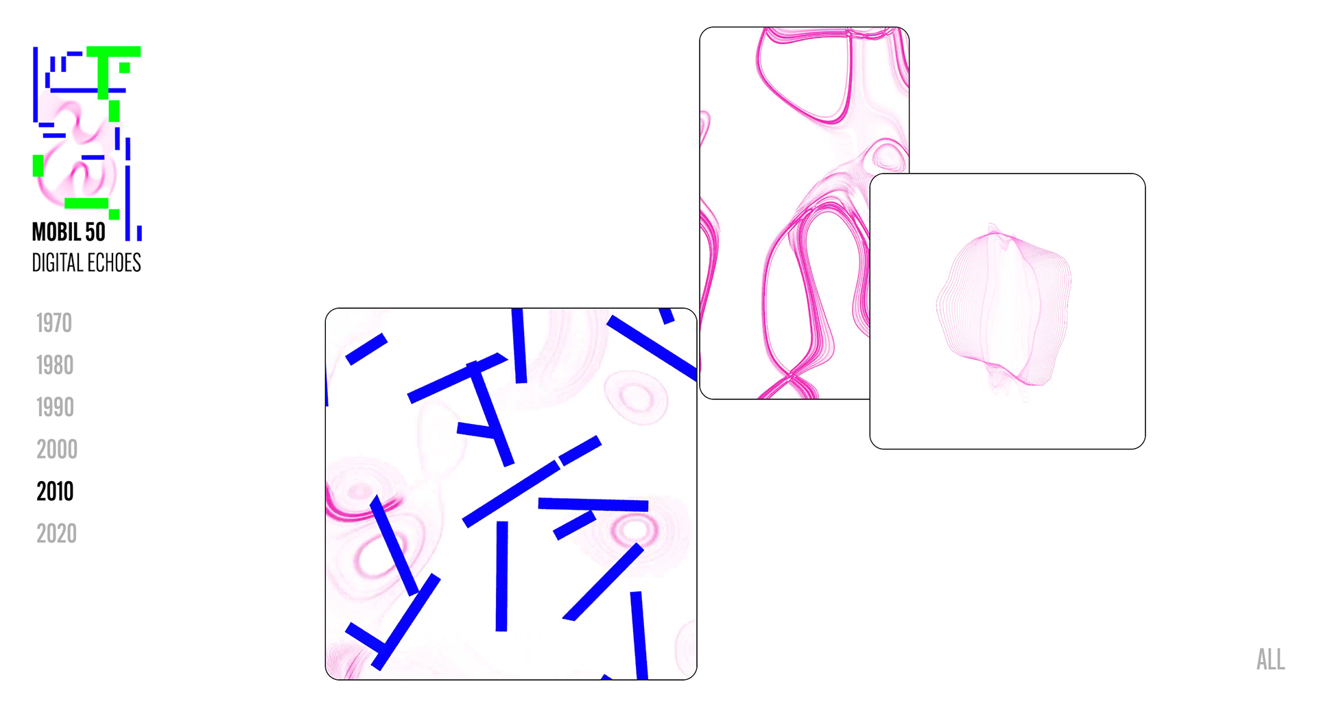
stills from the website
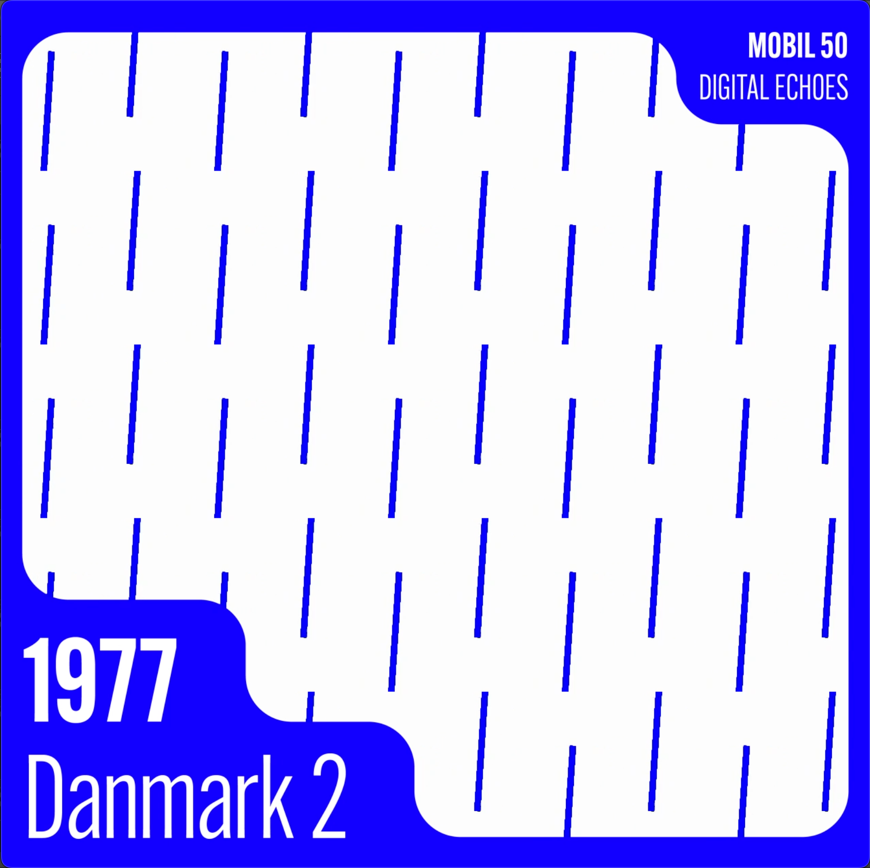
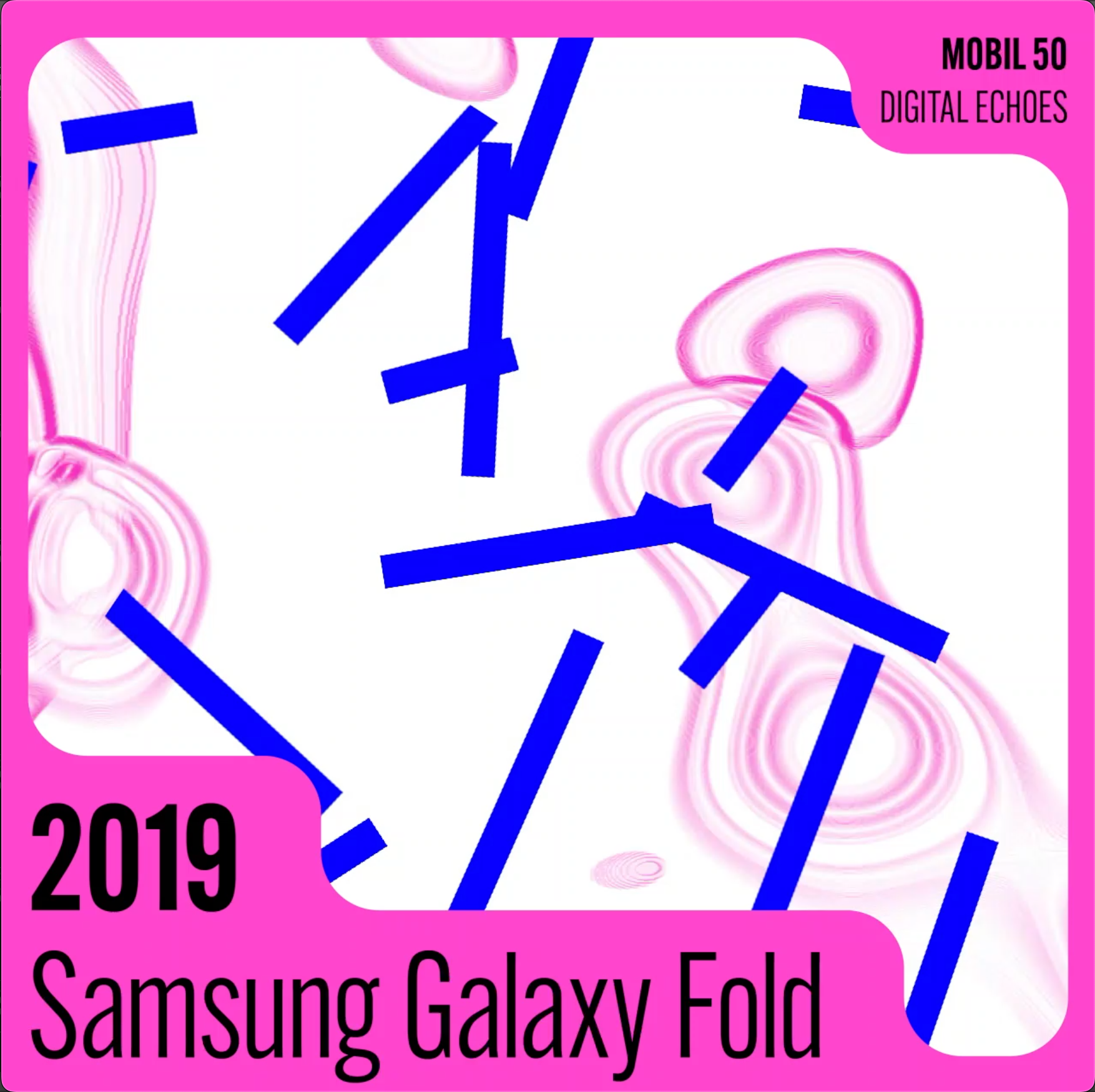
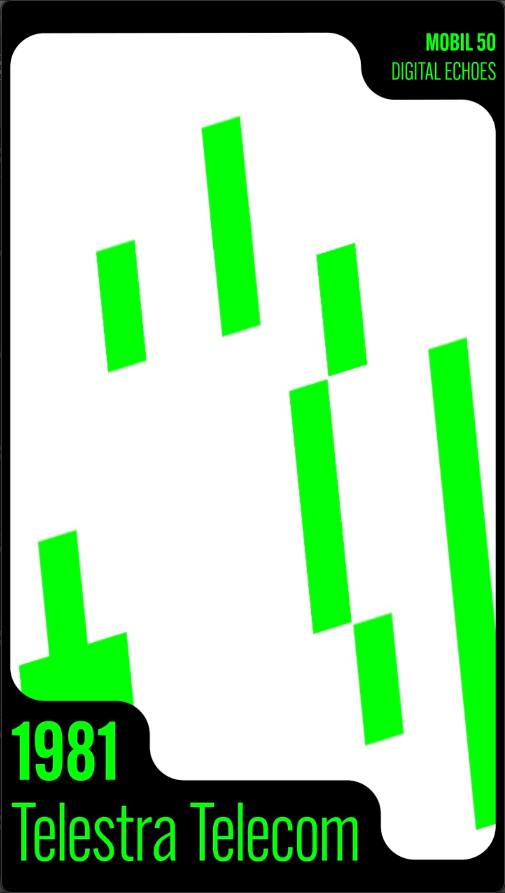
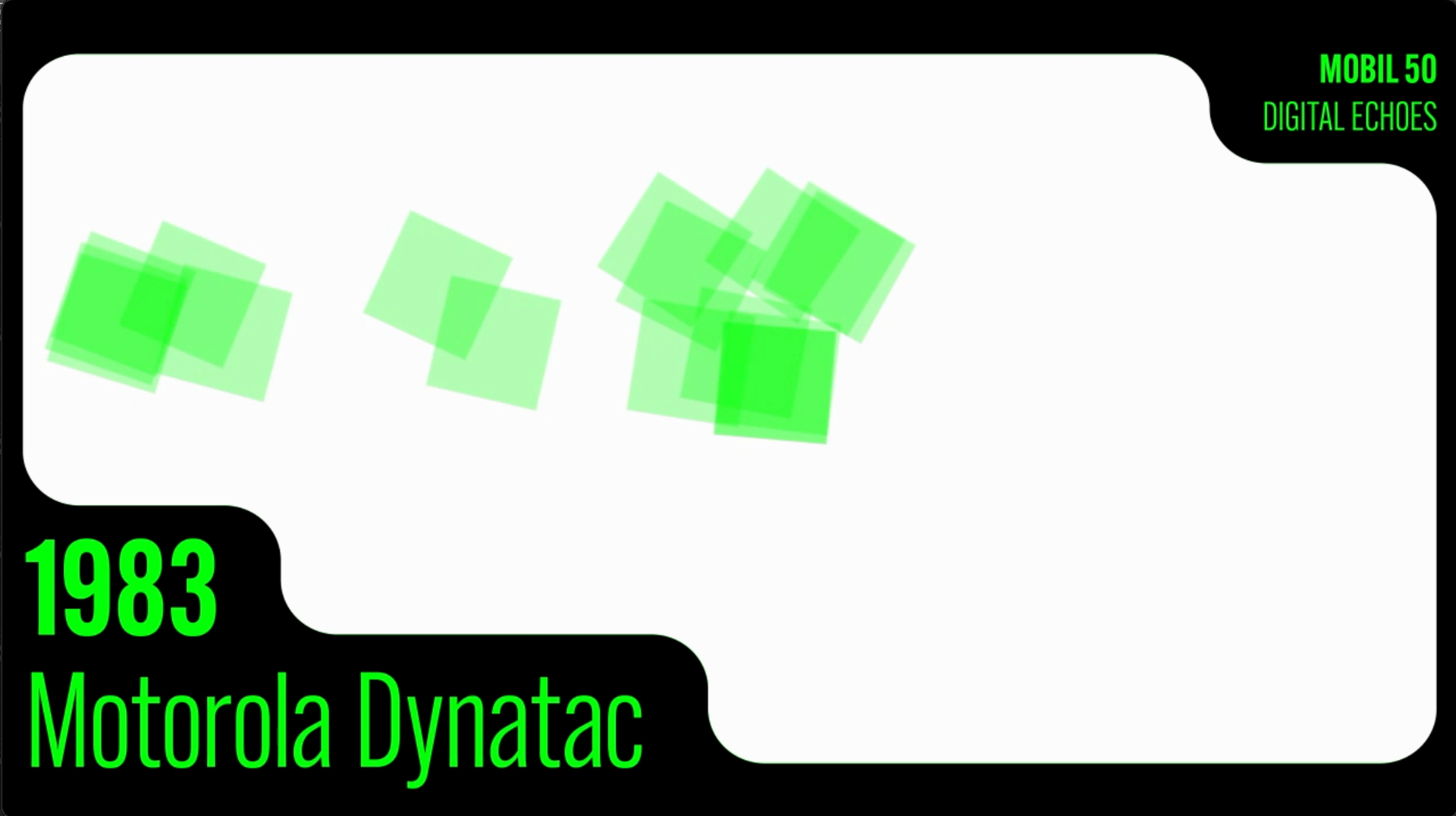
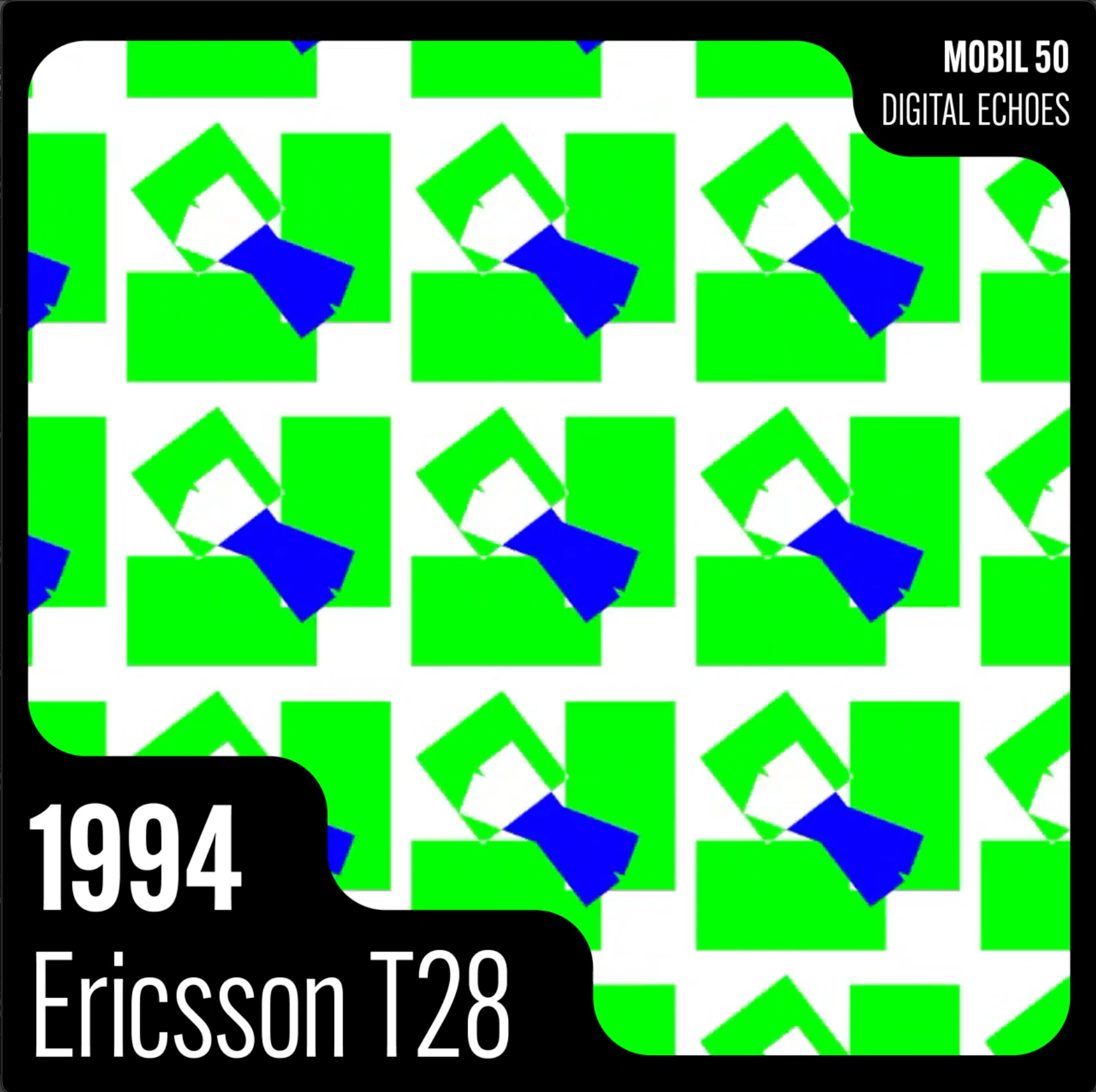
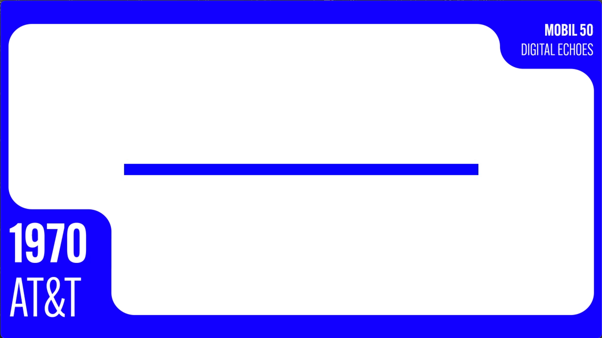
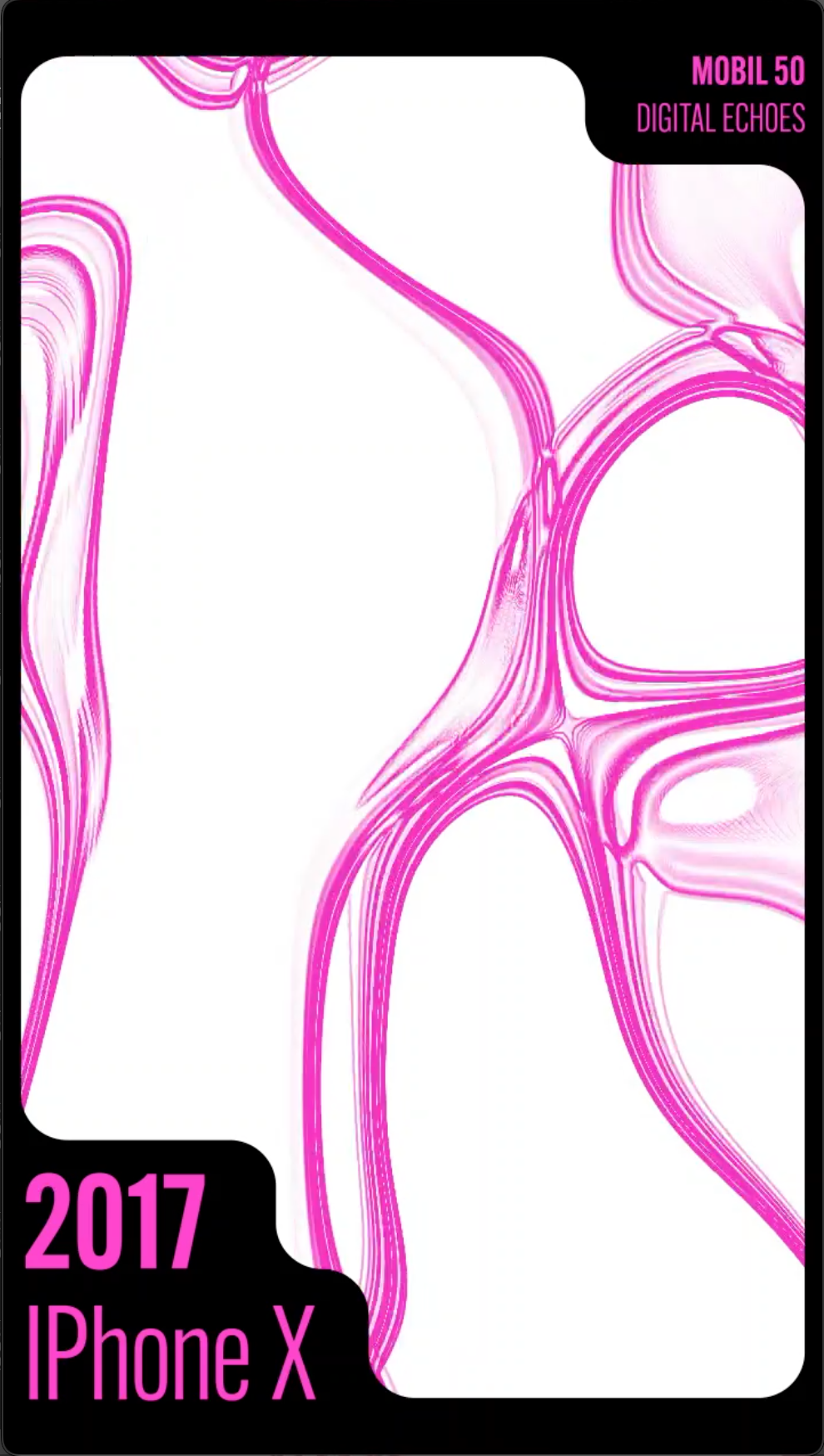
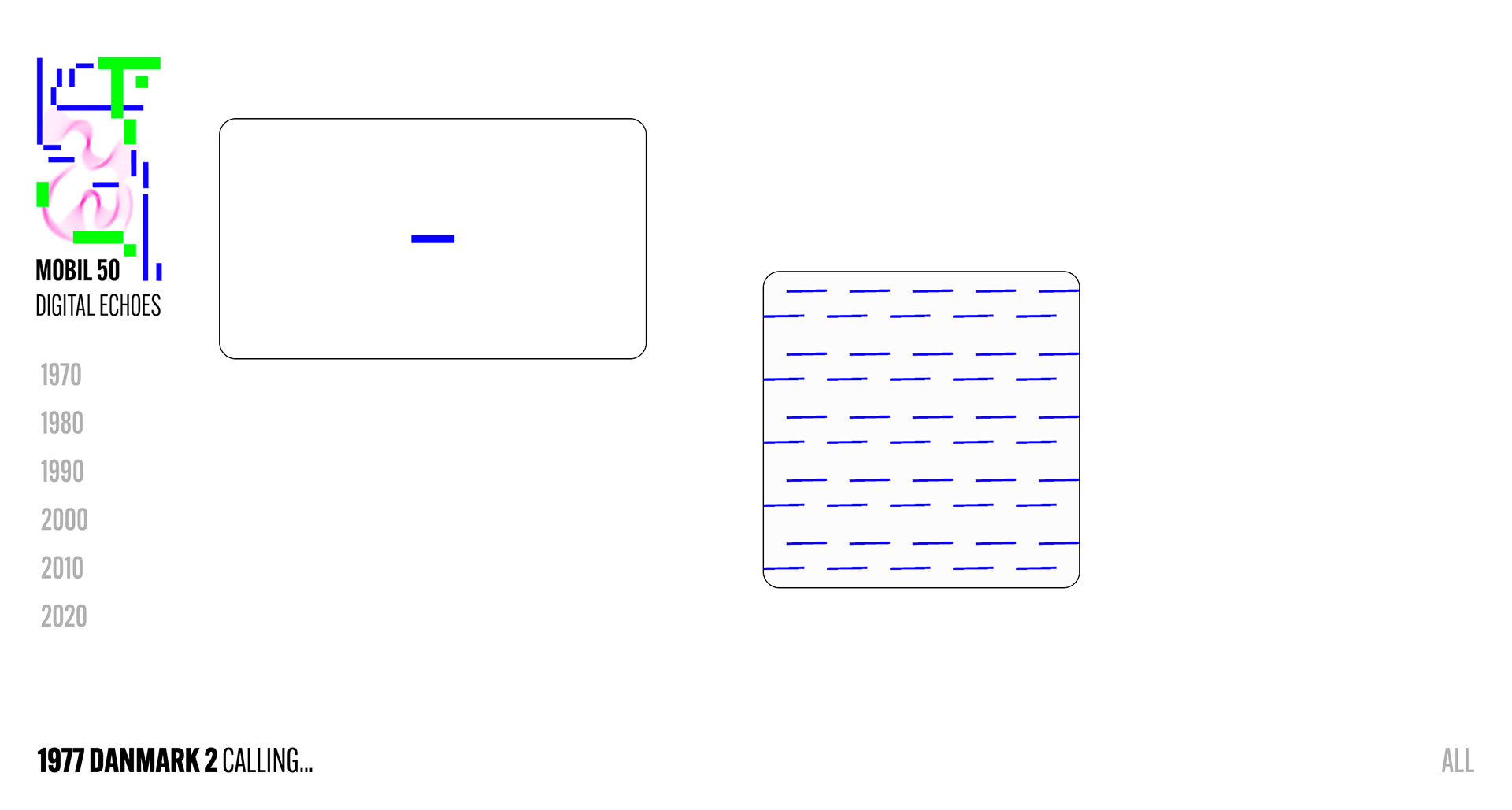
social media campaign (stills from videos)