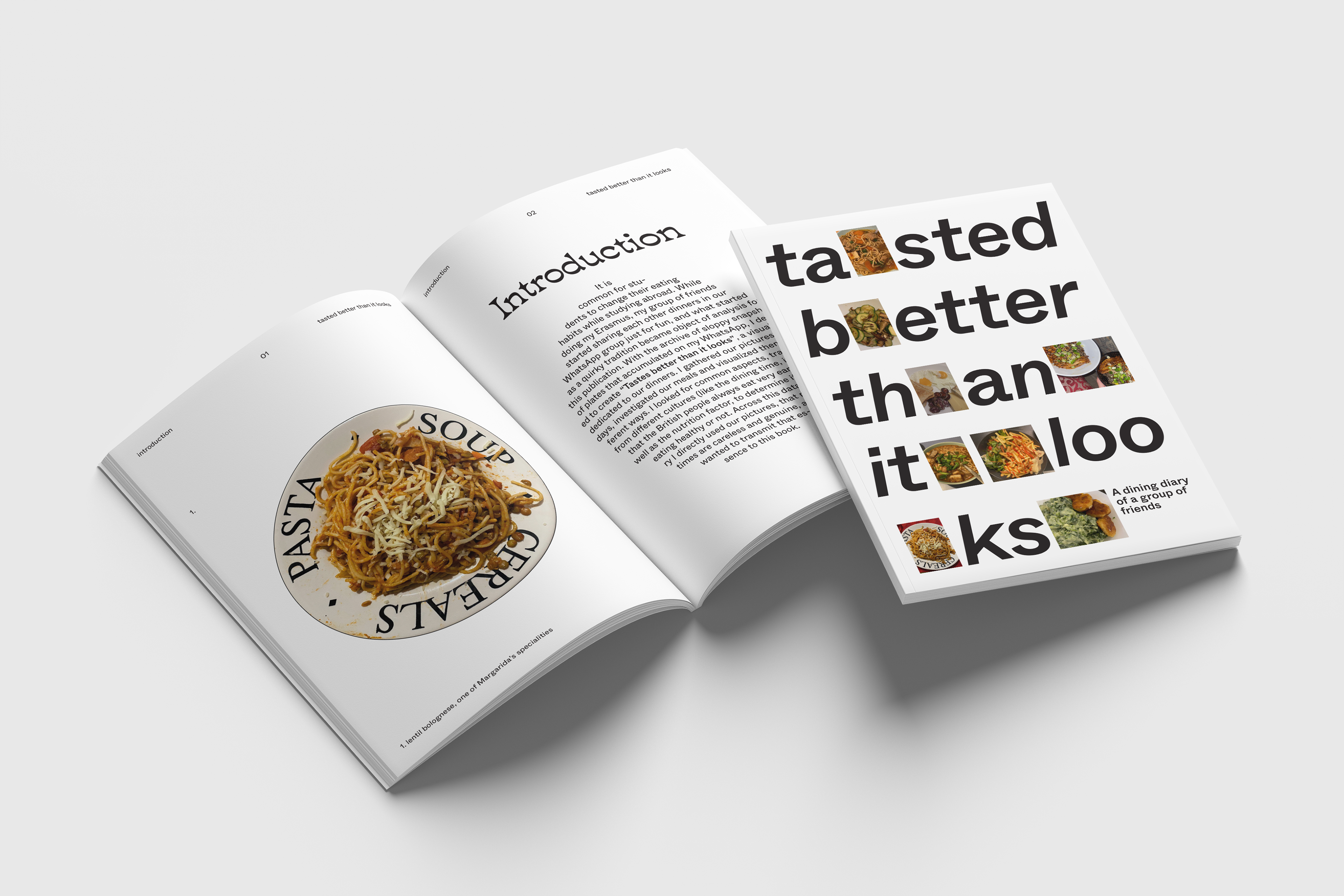
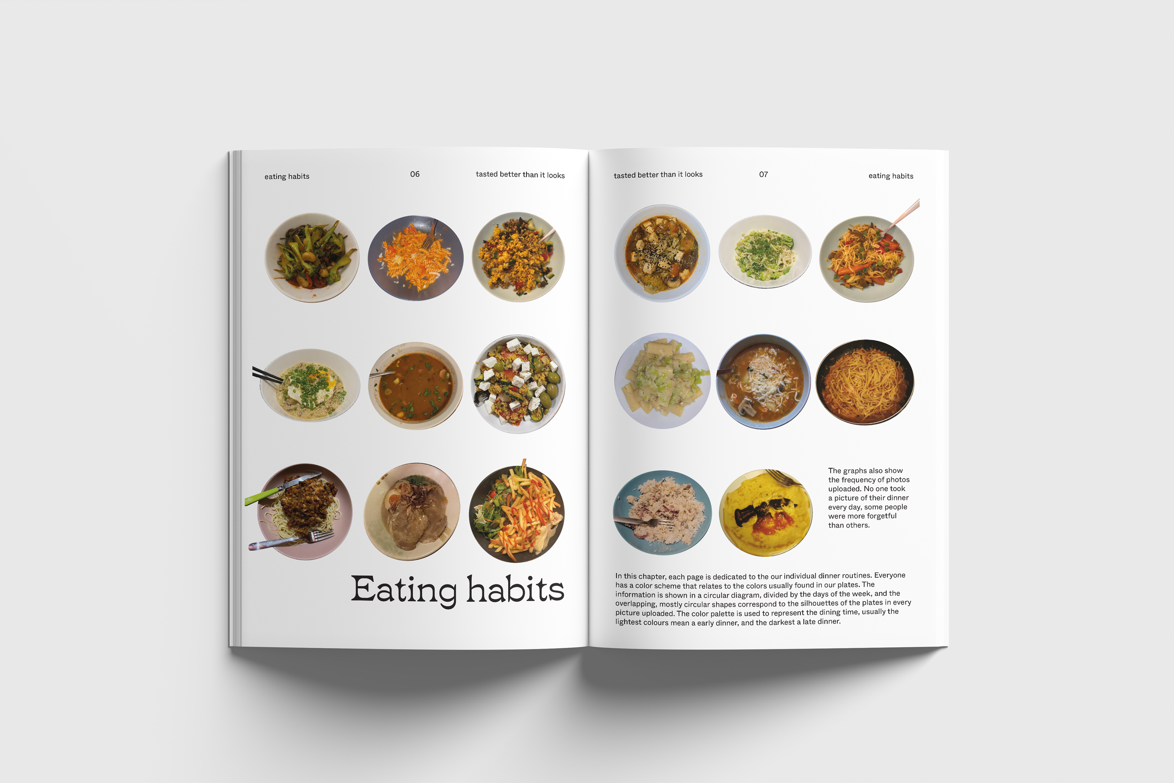
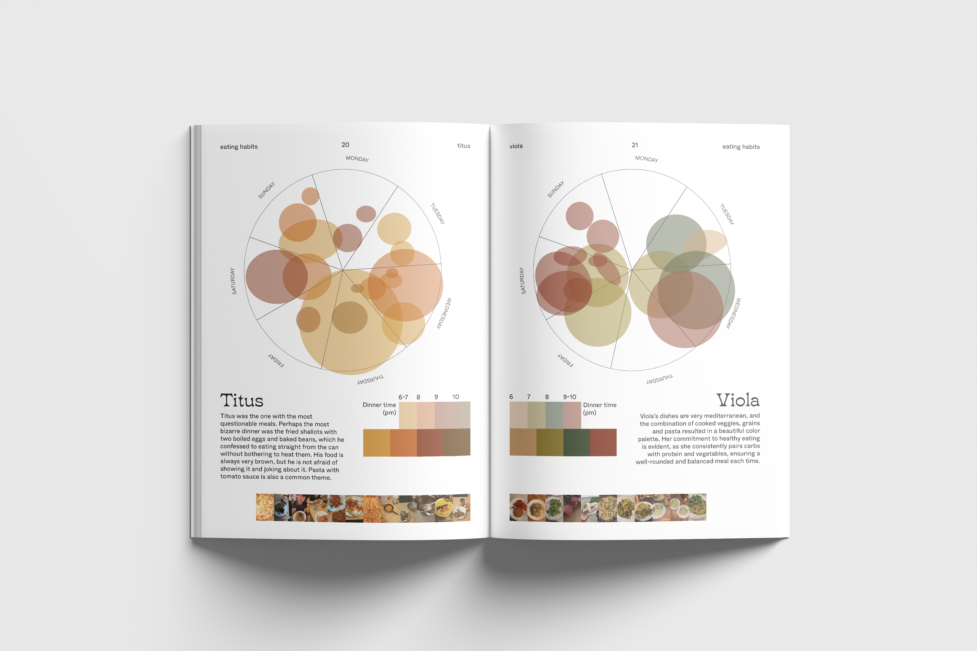
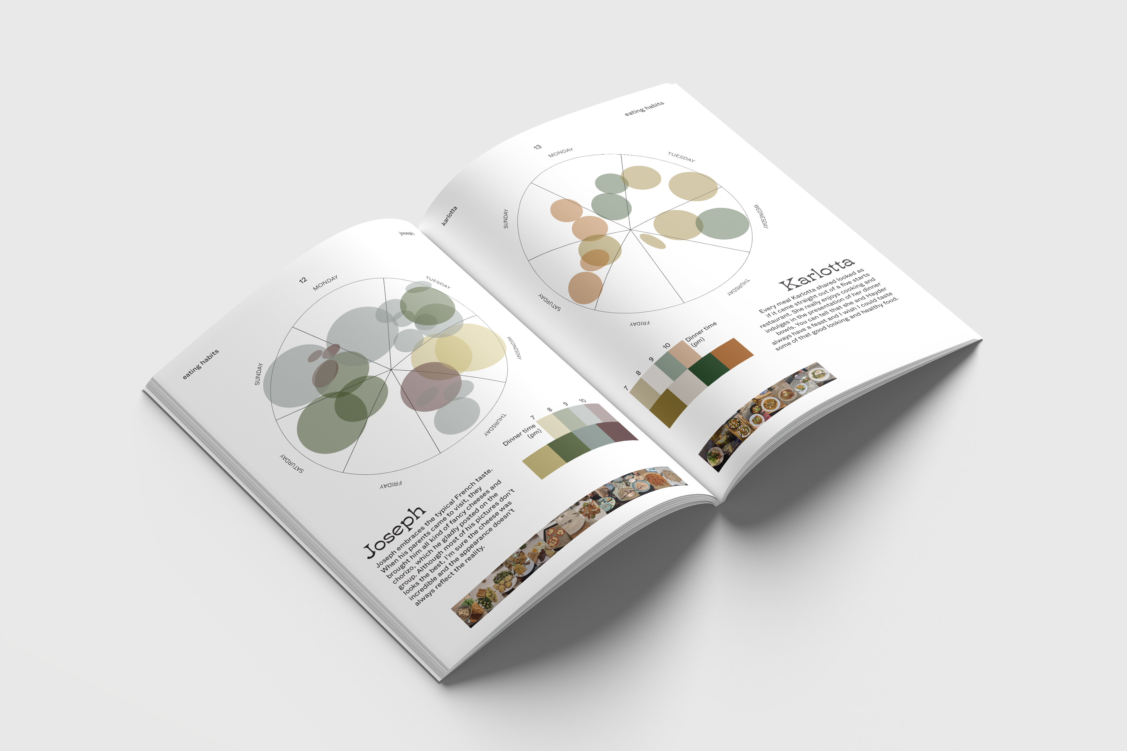
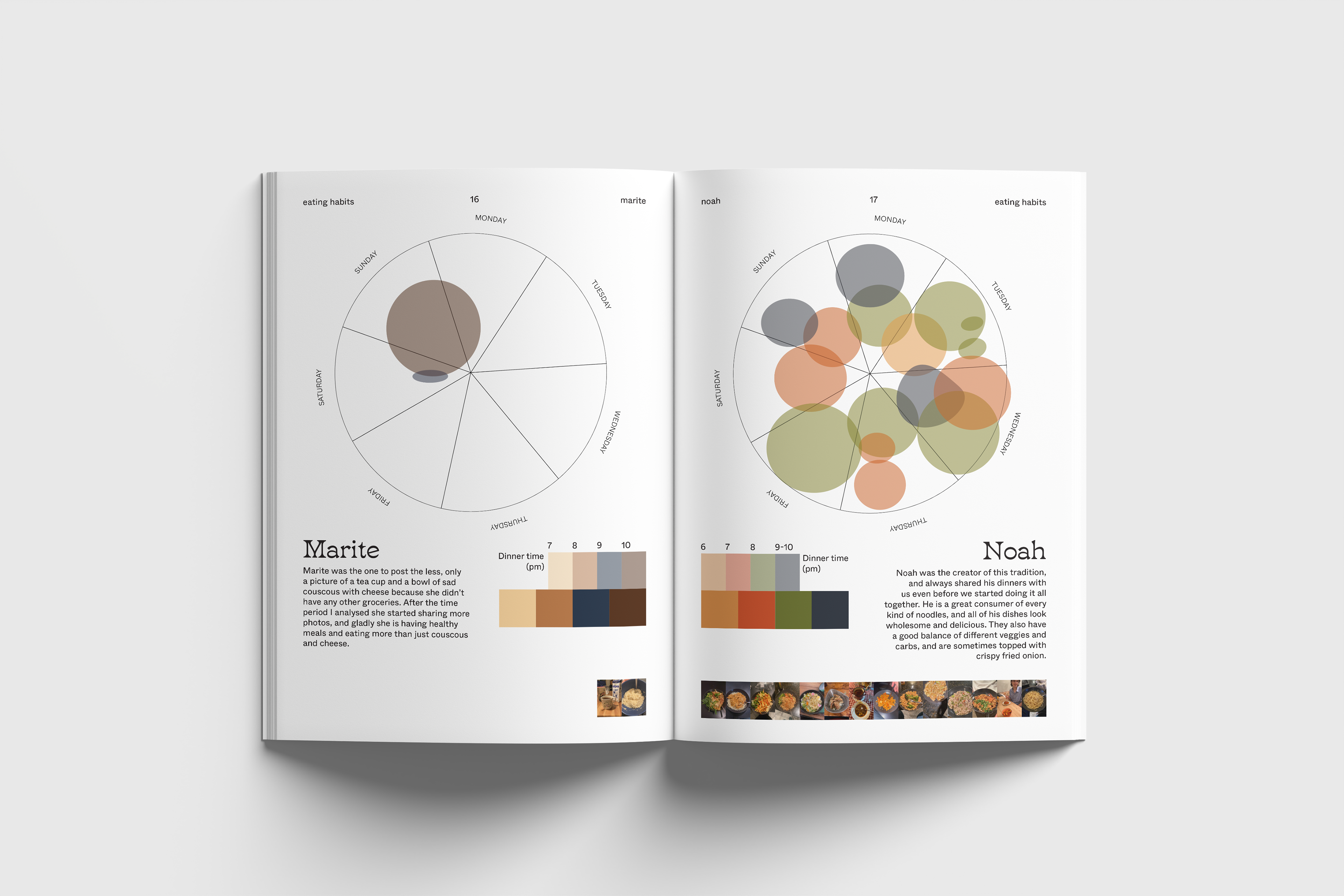
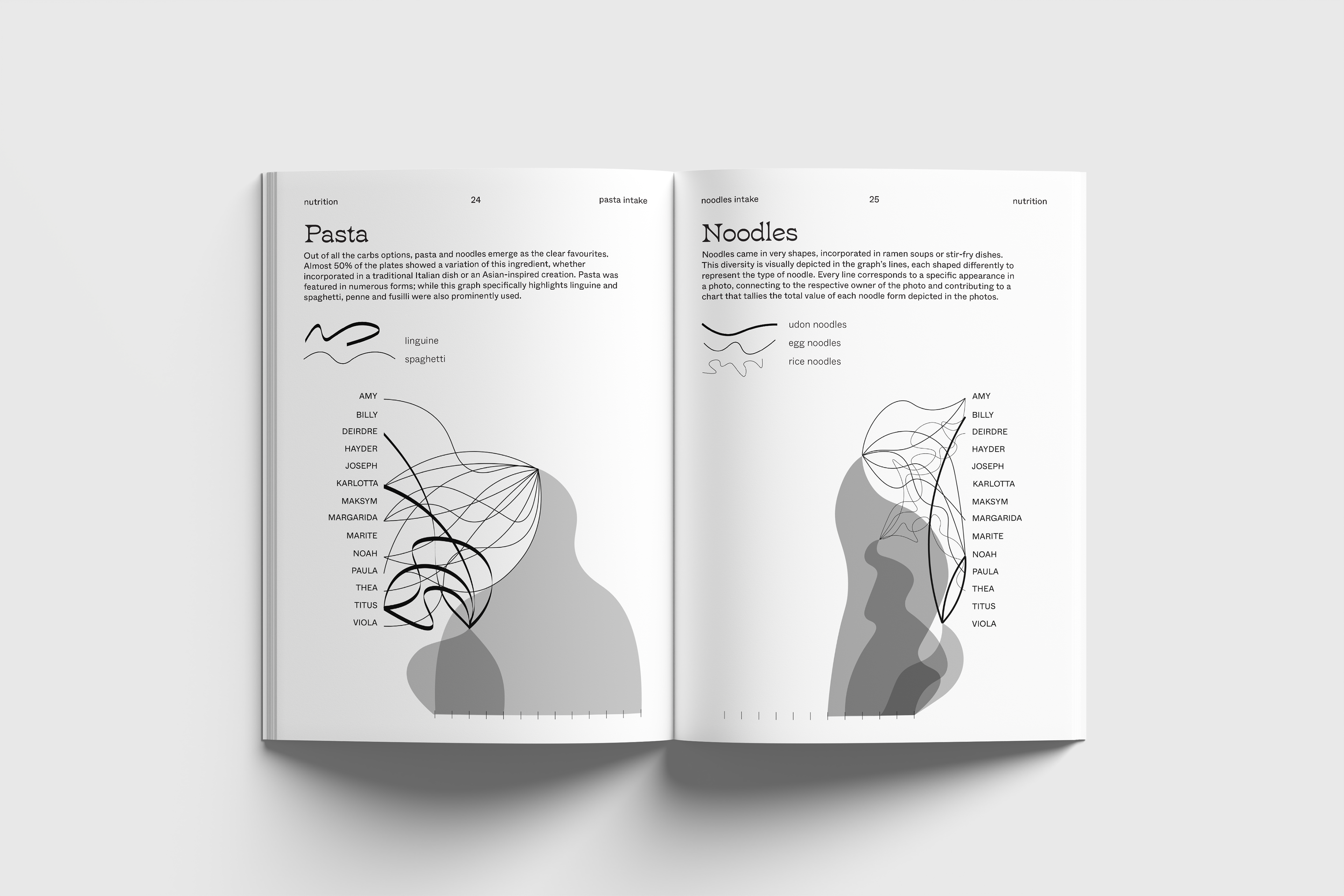
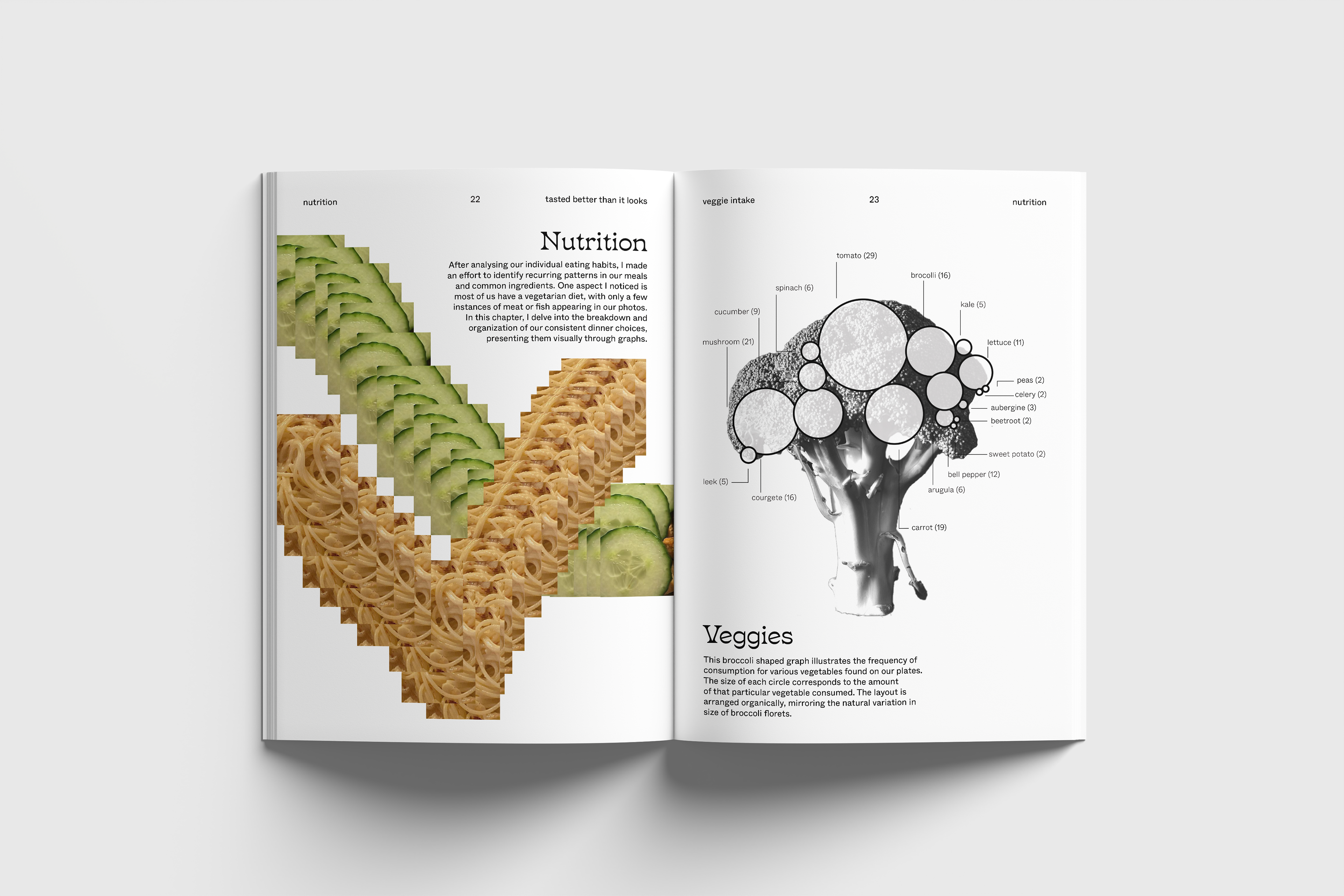
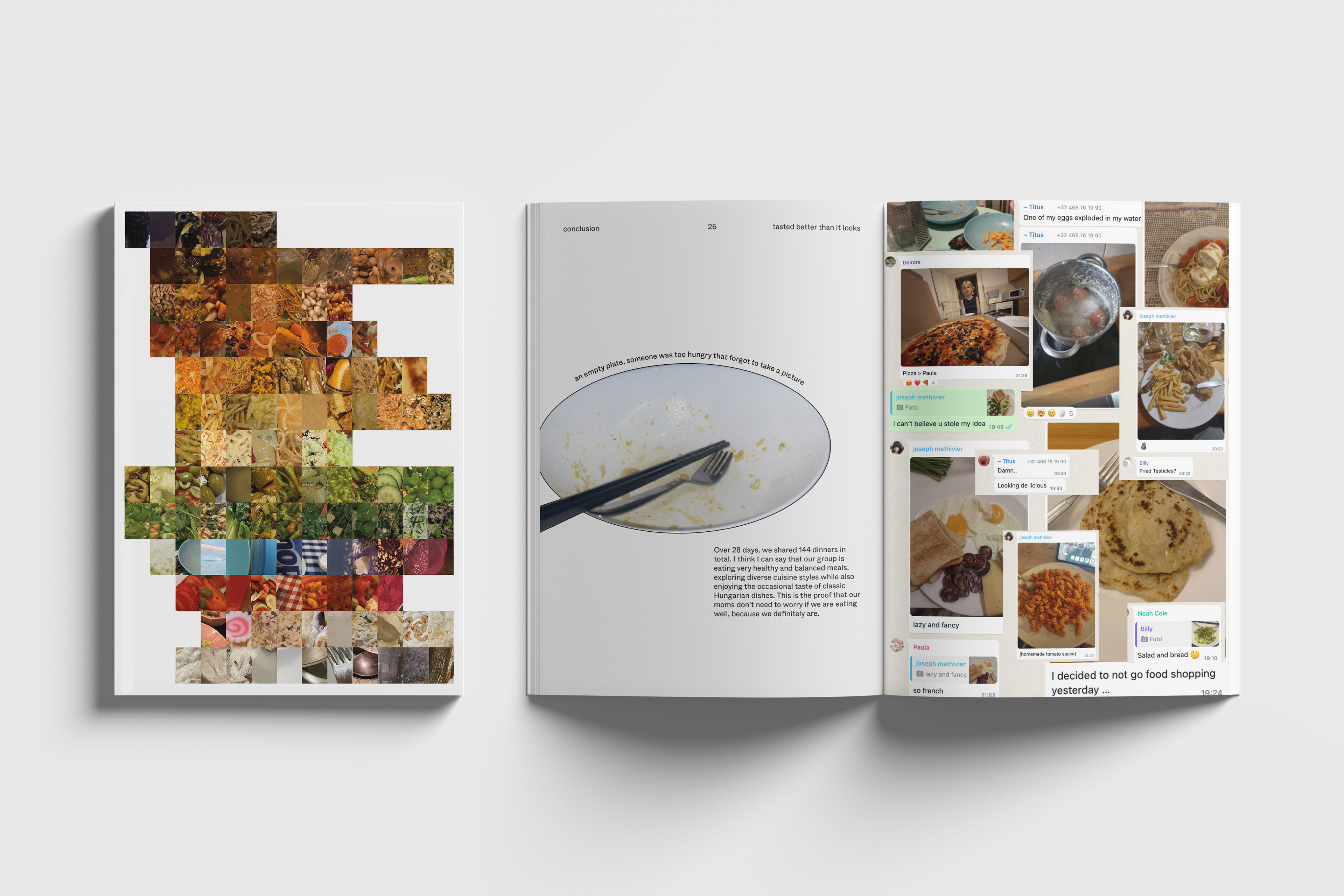
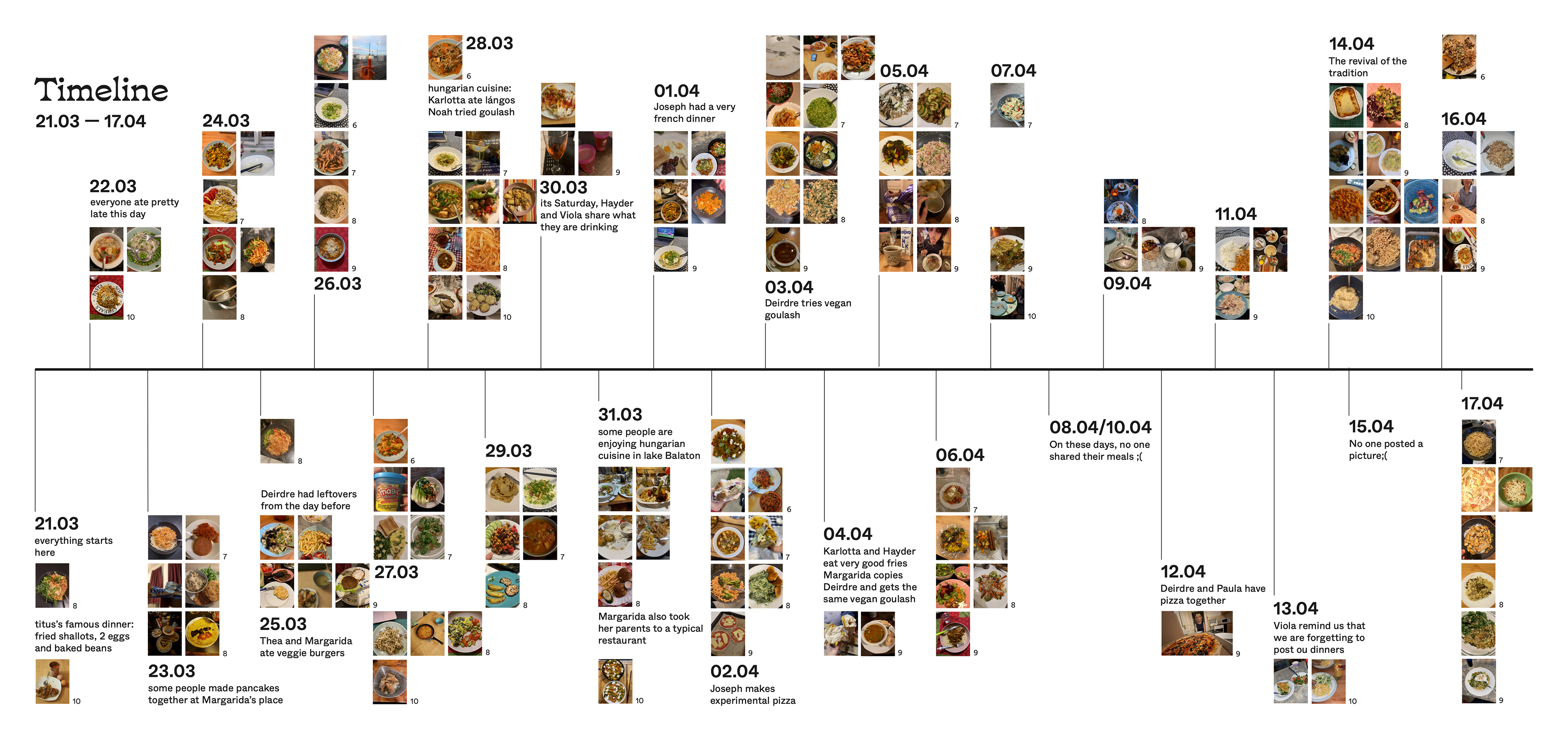

Data visualization project based on analysing eating habits. While doing my Erasmus, my group of friends started sharing each other dinners in our WhatsApp group just for fun, and what started as a quirky tradition became object of analysis for this publication. With the archive of sloppy snapshots of plates that accumulated on my WhatsApp, I decided to create “Tasted better than it looks”, a visual diary dedicated to our dinners. I gathered our pictures for 28 days, making in total 144 photos. I decided to investigate our meals and visualize them in different ways. I looked for common aspects, traditions from different cultures, as well as the nutrition factor, to determine if we are eating healthy or not.